5 Simple Ideas to Freshen Up Your Portfolio Site in 2024
Maybe you feel a little bored with your current website but you don't have the money or the time to fully redesign it. I know that feeling.
The good news is that with small changes that require less effort, you can freshen up your website in well under a day!
Something I’m learning about at the moment that can be applied to lots of areas in life is making small, consistent changes that will, over time, make a big difference. It’s also known as the Butterfly Effect.
So, rather than doing a big site overhaul, consider making small improvements to your website over time. This is something I did when I used to look after the website of the Directors & Editors Guild of Aotearoa New Zealand. That’s really how my love of web design began.
To give you some inspiration on what you can do, here are 5 simple ideas to polish up your portfolio or company website in Squarespace (I use version 7.1 Fluid Engine).
Today’s ideas:
Pick a new font family for your headings
I can say from experience that selecting a new typeface for your website’s headings can instantly make your site feel fresher.
To browse over a thousand font families directly available in Squarespace, click the paintbrush icon in the top-right corner of the editor to access your global Site Styles.
Then, go to:
Fonts > Headings > Family > Browse All Fonts
Personally, I find scrolling through a long text list of fonts quite tiresome. If you’re up for some coding, I recommend BeFonts ↗, a more visual resource for browsing high-quality free fonts. You can also browse Google Fonts directly and get a closer view of each font – most are included in Squarespace. Here’s our guide to help you master custom fonts, if you choose to go down this route.
👉 TIP: Aim to select a font that reflects the personality of you and your brand.
If you’re unsure where to start, here are a few font ideas representing three different font styles. All have free/pay what you want versions.
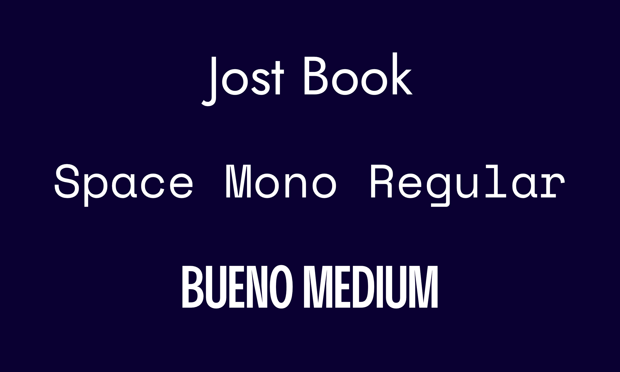
Jost by Indestructible Type ↗ is a popular and functional offspring of Futura. It takes the much loved classic and updates it for the digital age.
Space Mono ↗ is a free monospace by Colophon Foundry that gives off retro sci-fi/futuristic vibes.
Bueno by Rajesh Rajput ↗ is a condensed display typeface for those looking for a bold, attention-grabbing font.
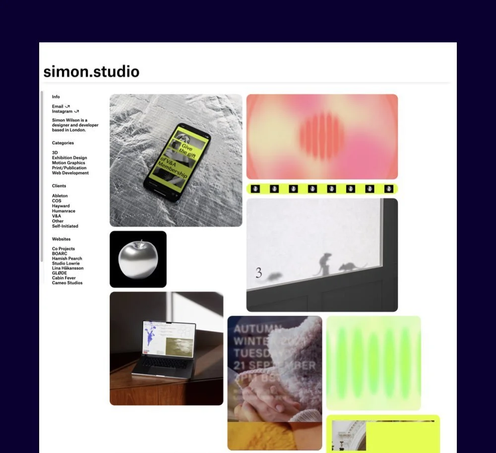
Update your home page
When was the last time you changed the projects out on your home page? As the most frequented page on your site, swapping out older productions with more recent ones can give visitors the impression that you’ve been active and busy. Because you have been busy, just BTS.
The start of a new year is a great time to take a moment to spring-clean your portfolio. Try to only keep projects that reflect the work you want to do now/in the future. And while it might be sad to unpublish old works, prune and make space for newer work that showcases your skills and talents.
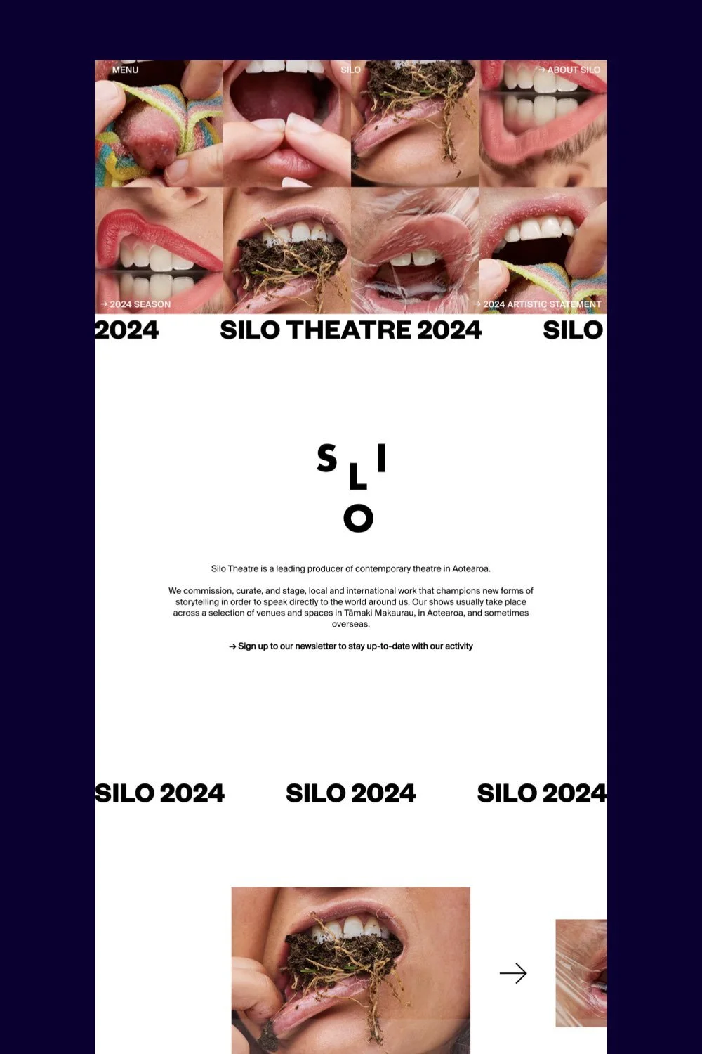
Add rounded corners to images
Our eyes love rounded corners ↗ more than sharp corners. It’s why rounded corners are so ubiquitous in the design world. Find them across apps, websites and other interfaces. Look up! I bet your browser features rounded corners too.

“Rounded corners also make effective content containers,” writes Anthony Tseng, the founder of the online publication UX movement. “This is because the rounded corners point inward towards the centre of the rectangle. This puts the focus on the contents inside the rectangle.”
Rounded corners look modern. And they’re subtle too. With a bit of code, I’ll show you how you can curve those corners in Squarespace!
Here’s how:
For image blocks on pages, you can adjust these without code individually. Just click the edit button on the image, access the design tab, and adjust the corner radius property.
How to add round corners to blog images
You can universally round all corners on blog images within blog posts by adding the following code snippet to the Custom CSS editor (find it by hitting ‘/’, then type custom CSS).
To change how rounded you’d like your corners to be, simply replace the pixel (px) value where I’ve used 9px.
//BLOG IMAGES - Round corners
.blog-item-content-wrapper .sqs-image-shape-container-element {
  border-radius: 9px;
}
How to add round corners to images on a blog page
With blog pages, you’ll need to use a different code snippet depending on the layout of your blog. Replace ‘9’ to change how rounded you like your corners.
Basic Grid Blog
//BASIC GRID BLOG THUMBNAILS - Round corners
.blog-basic-grid .image-wrapper {
  border-radius: 9px;
}
Side by Side Blog
//SIDE BY SIDE BLOG THUMBNAILS - Round corners
.blog-side-by-side .image-wrapper {
  border-radius: 9px;
}
Single Column Blog
//SINGLE COL BLOG THUMBNAILS - Round corners
.blog-single-column .image-wrapper {
  border-radius: 9px;
}
Masonry Blog
//MASONRY BLOG THUMBNAILS - Round corners
.blog-masonry .image-wrapper {
  border-radius: 9px;
}
Alternating Side by Side Blog
//ALT SIDE BLOG THUMBNAILS - Round corners
.blog-alternating-side-by-side .image-wrapper {
  border-radius: 9px;
}
How to add round corners to summary blocks
The next code snippet will universally round corners of the images in all of your summary blocks. Again, you can replace ‘9’ with a different value to determine the roundness of your corners.
//SUMMARY BLOCKS - Round corners
.summary-thumbnail {
  border-radius: 9px;
}
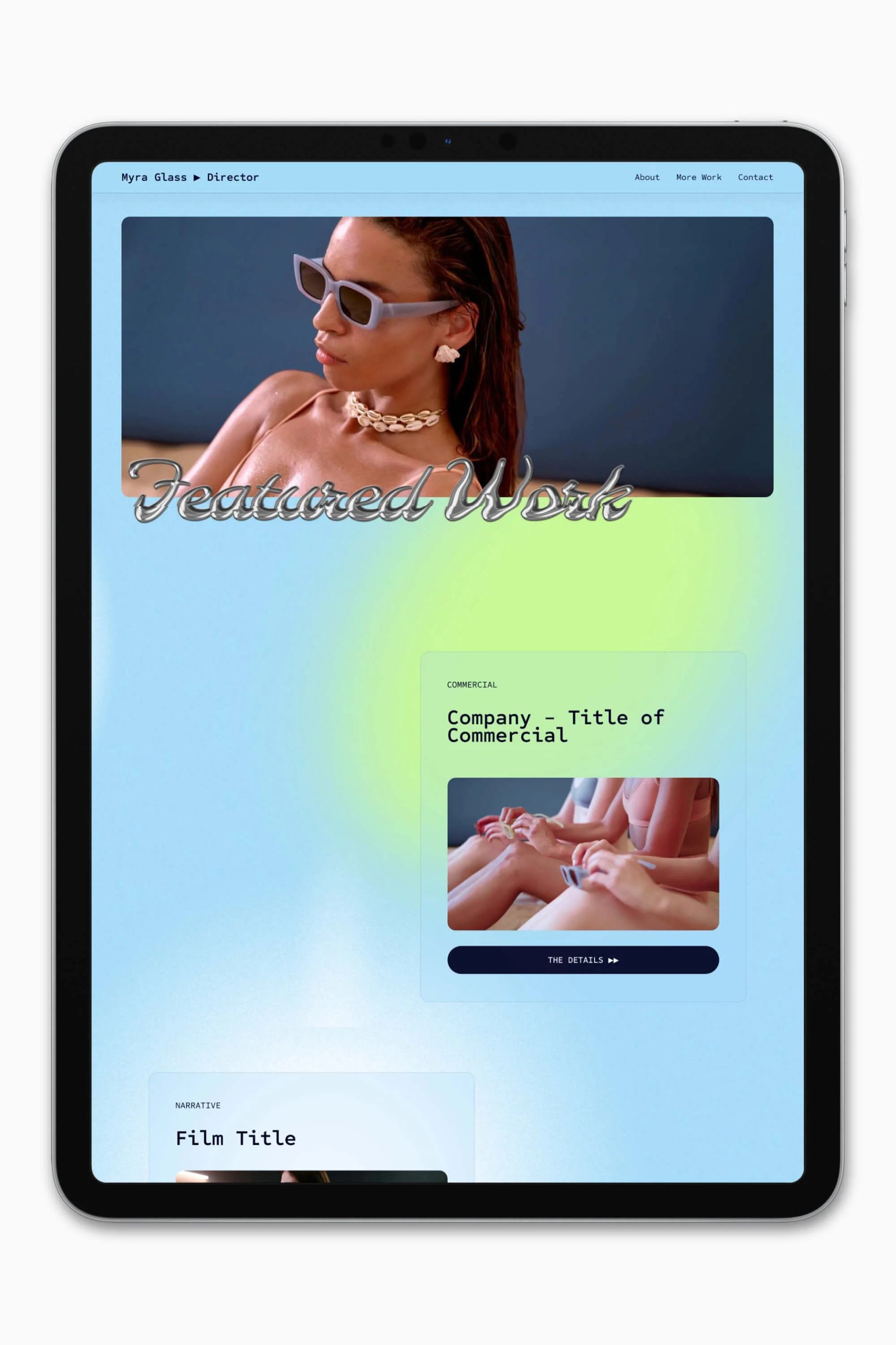
Add more negative space
Give your website a breath of fresh air by incorporating more whitespace, aka negative space, into its design. Remember, whitespace doesn’t have to be white at all!
For several years, web design has shifted away from densely-packed content towards more spacious layouts. This trend emphasizes clean aesthetics and enhances user experience.
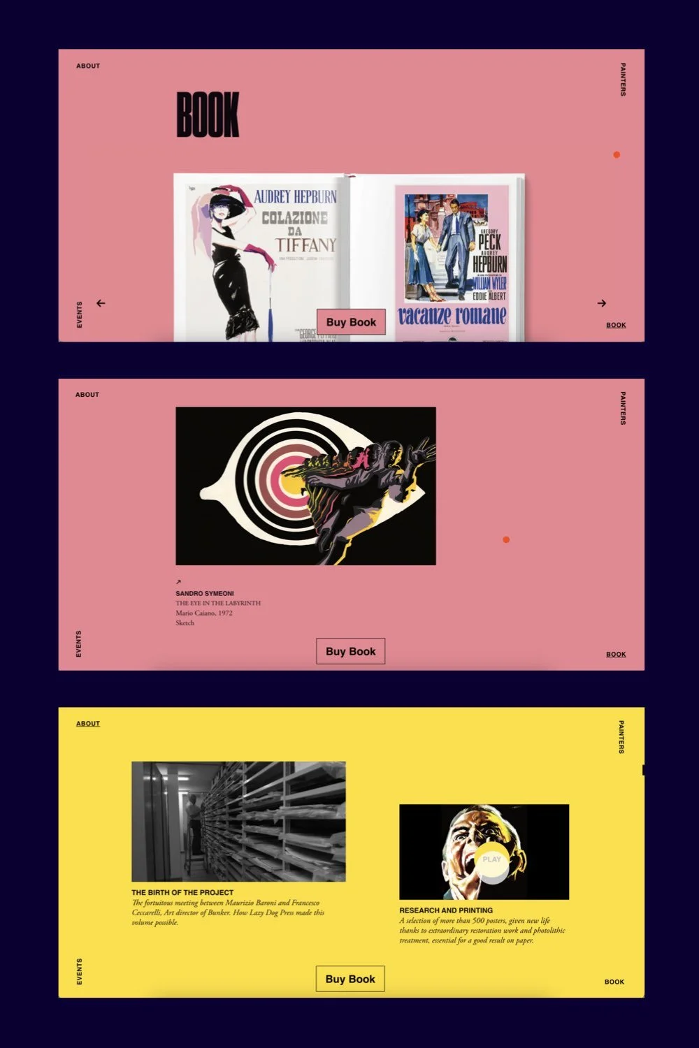
By allowing content to breathe and creating a clean, uncluttered layout, you can both foster readability while adding a touch of sophistication to your online presence.
Here are some simple ways and places to add negative space:
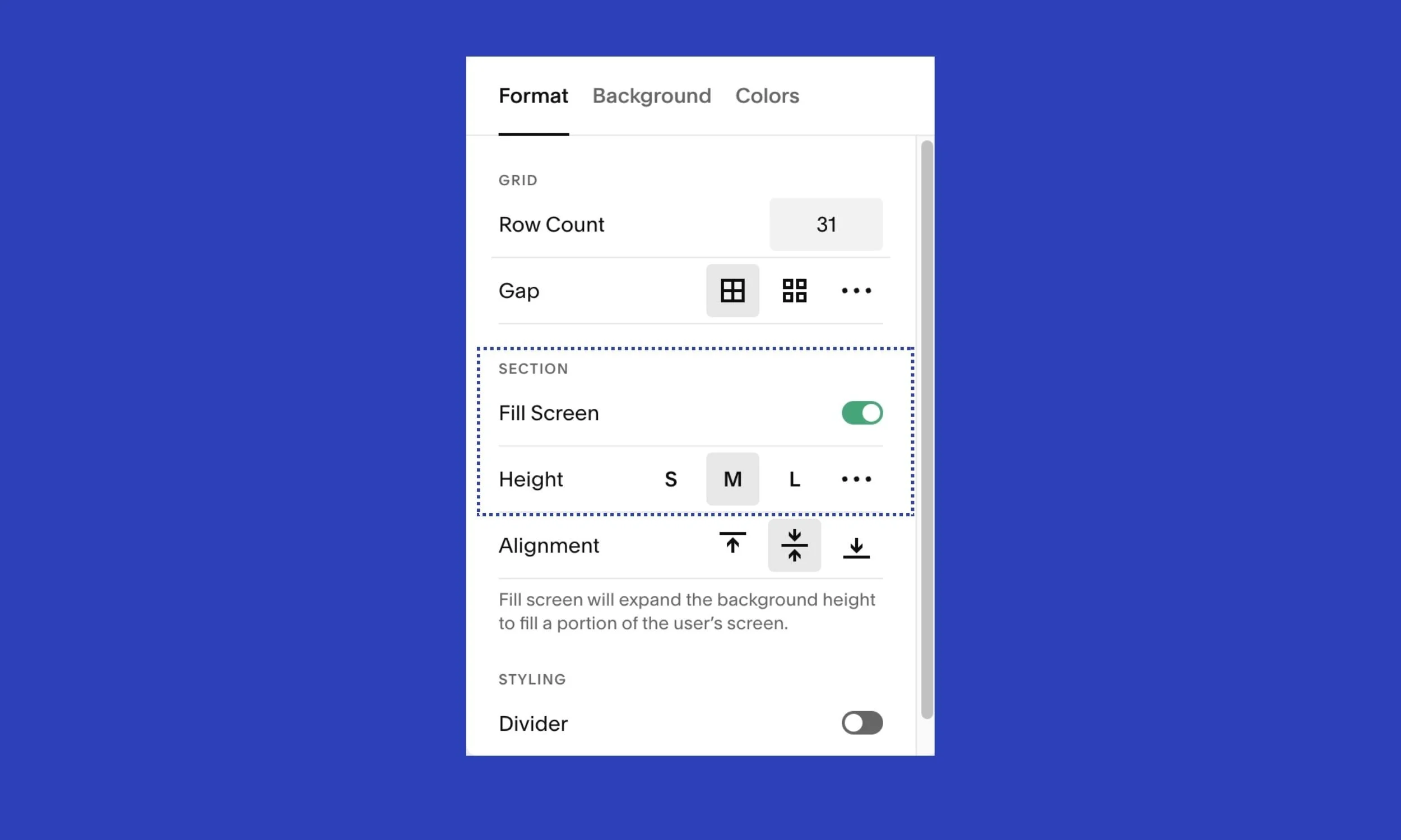
Add more height to your sections. If you’re using Squarespace 7.1 Fluid Engine, click on Edit Section > make sure Fill Screen is toggled on > increase the height.
Add more padding around images and buttons. Do this by dragging your elements further apart in the Fluid Engine editor.
Generally-speaking, we tend to add less whitespace than we need. So go 10% more if you’re unsure if you’ve got enough.
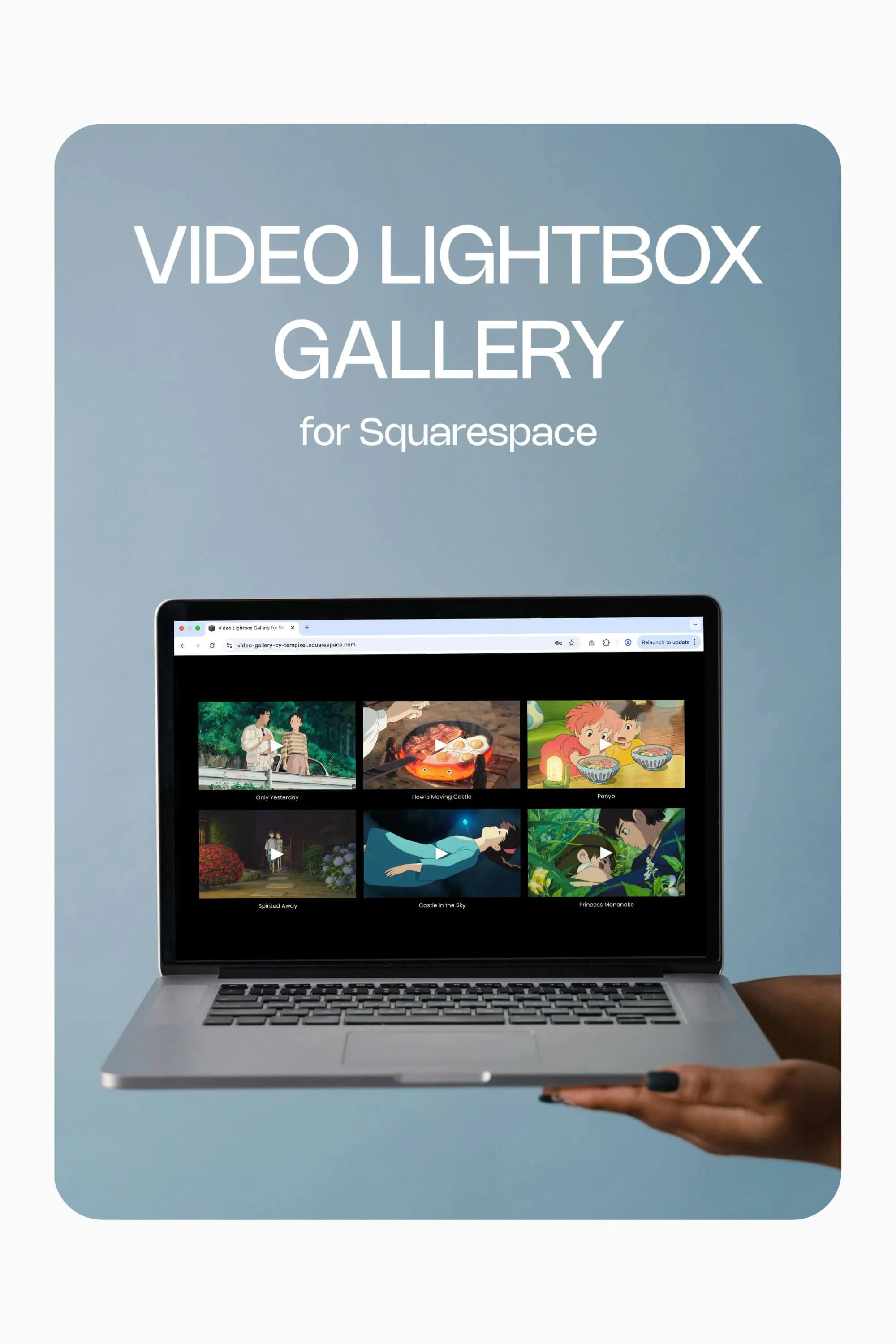
Change the layout and styling of summary blocks / your blog / gallery sections
This idea’s a quick one to execute! Squarespace provides several options for styling summary blocks, blogs and galleries.
Maybe you’ve been presenting your film/theatre productions in the basic grid style with images in a 1:1 ratio. Why not change it to a widescreen ratio? Or 4:3?
Have a play with the layout options, number of columns, and image spacing and aspect ratio.
There you have it, 5 simple ideas to breathe new life into your website. Keep improving your site, one small change at a time!
TIME FOR A REFRESH?