8 Film Production Company Websites to Inspire You
Happy new year! I hope you found time to relax, spend time with loved ones, and get away from your computer and inbox over Christmas.
At the beginning of a new year, you may feel inspired to refresh your website or even launch one. Go you! If you’re in need of some web design inspo, here are 8 wonderful production company websites that make an impact.
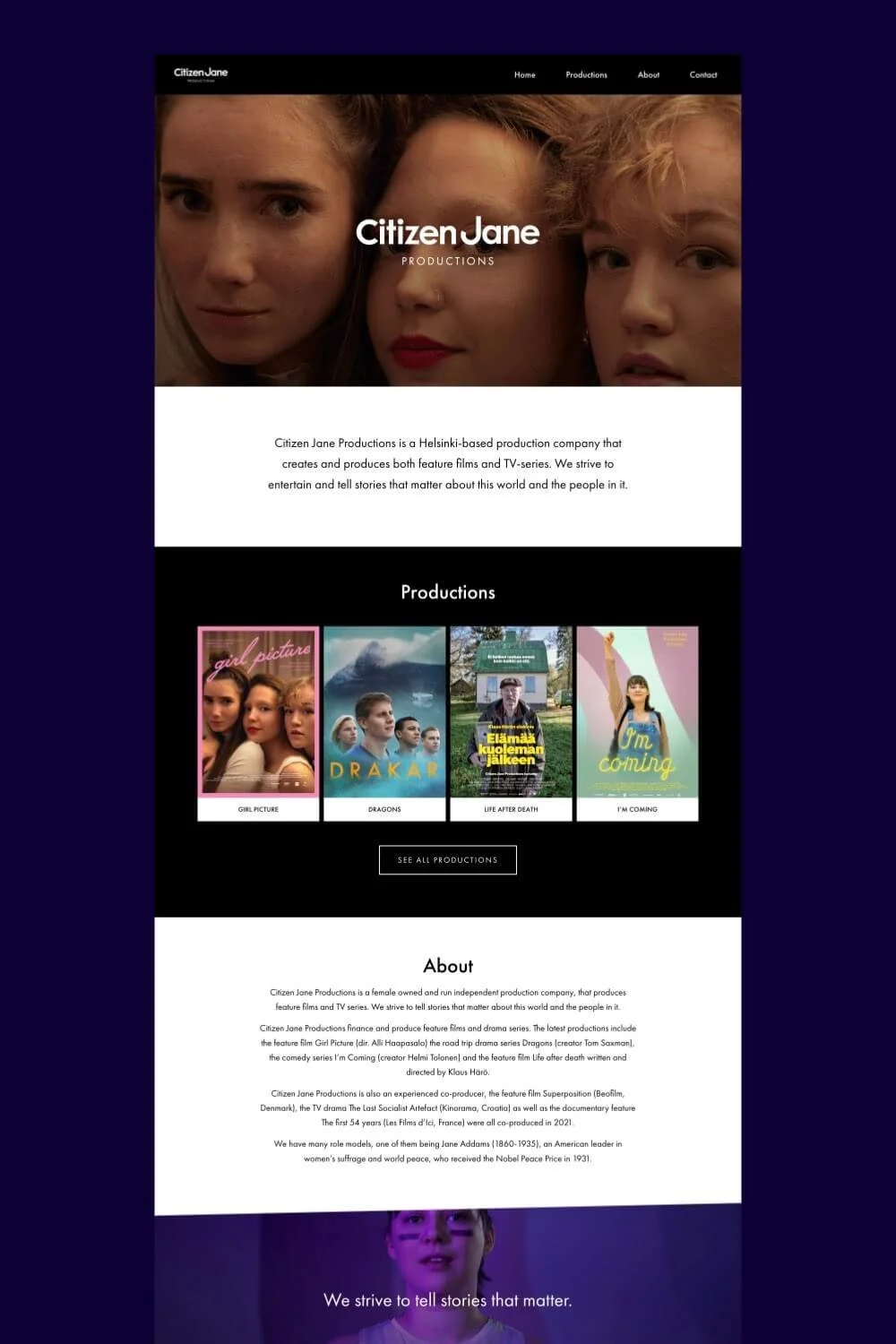
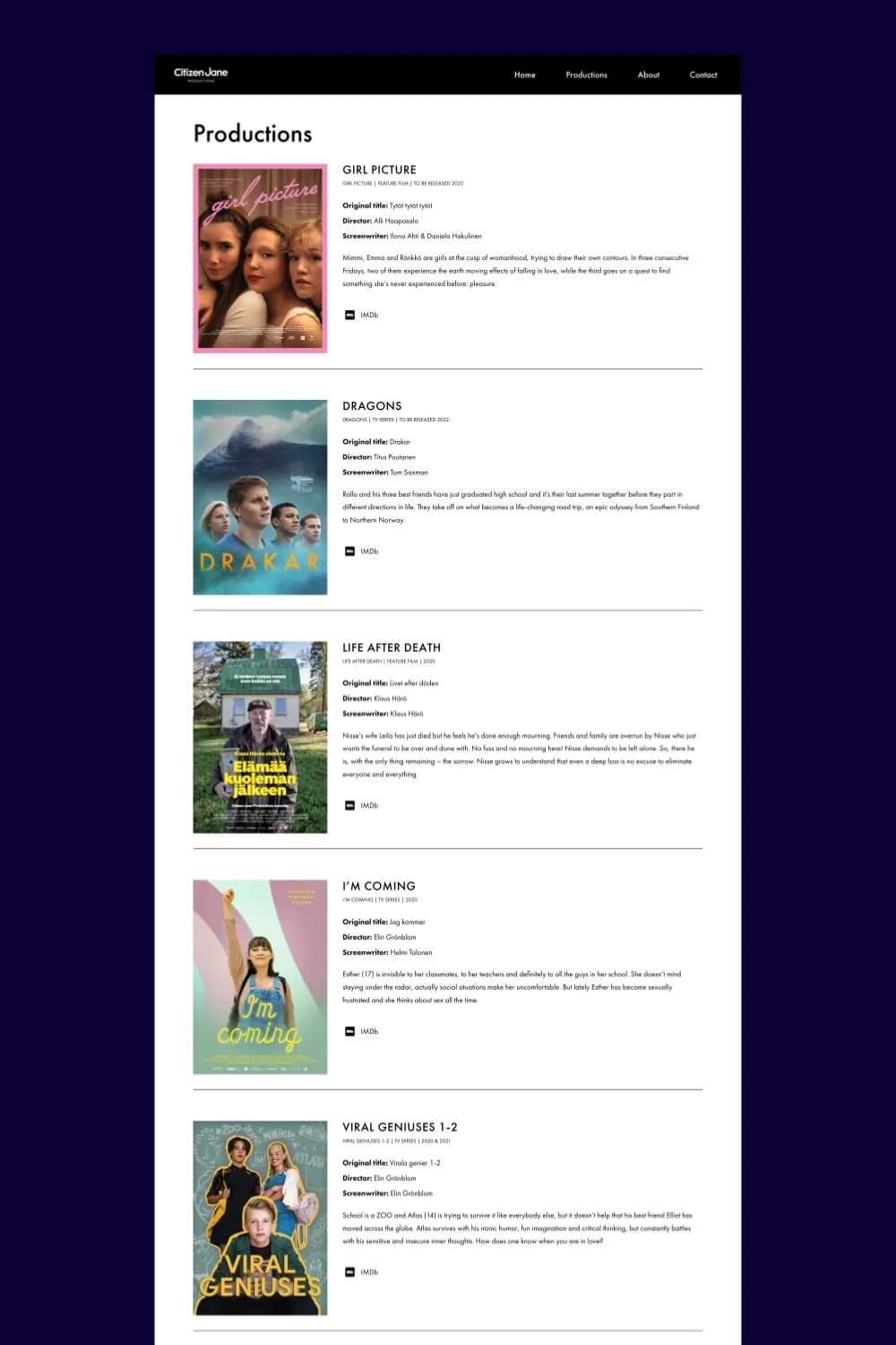
Citizen Jane Productions
First up is Citizen Jane Productions, a female-led production company operating out of Helsinki. They specialise in creating and producing feature films and TV-series.
Highlights
The homepage banner gracing the top of the page is immediately eye-catching. It shows the company’s logo atop a key image from their film Girl Picture. Extra bonus points for picking a photo with faces in close-up; our brains are drawn to faces! It’s followed by a 2-sentence tagline* that makes clear what the company and website is about.
Only 4-pages in size, Citizen Jane nails simplicity! As Charles Mingus Jr. said, “Making the simple complicated is commonplace; making the complicated simple, awesomely simple, that's creativity.” This is one of the best homepages I’ve ever seen in the film and TV industry. And what a genius idea to house all projects on a single ‘Productions’ page; forget sub-pages! (my God, I’ve simply been doing everything wrong…)
Across the site, information is presented clearly. It tells us who they are, what they do and how you can contact them.
*A website tagline is a short, memorable message that communicates what your company does and how your brand is different.
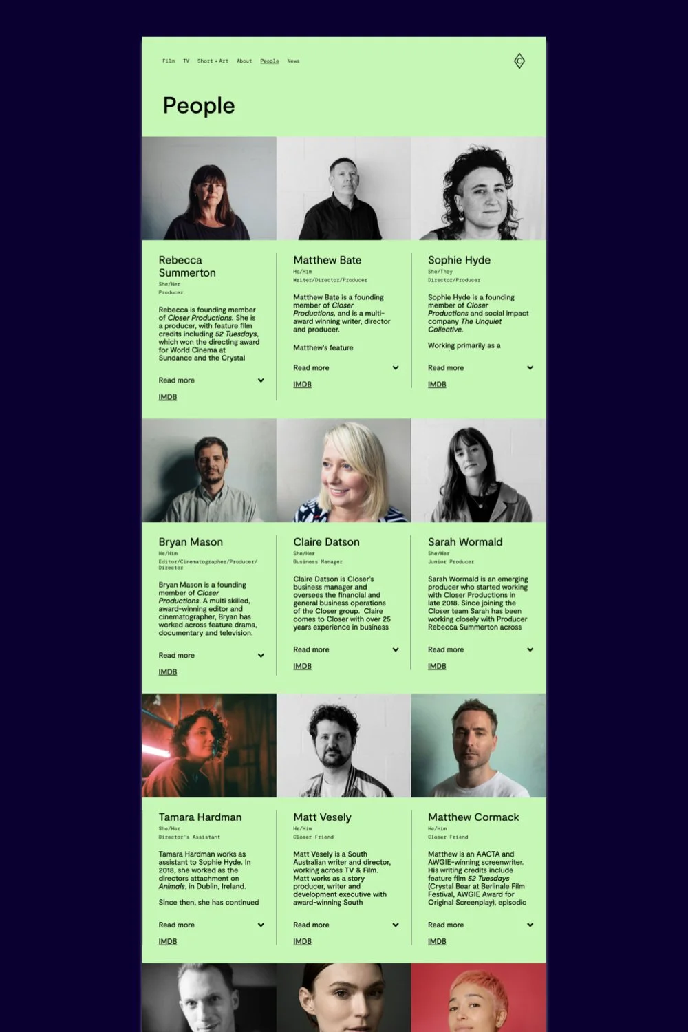
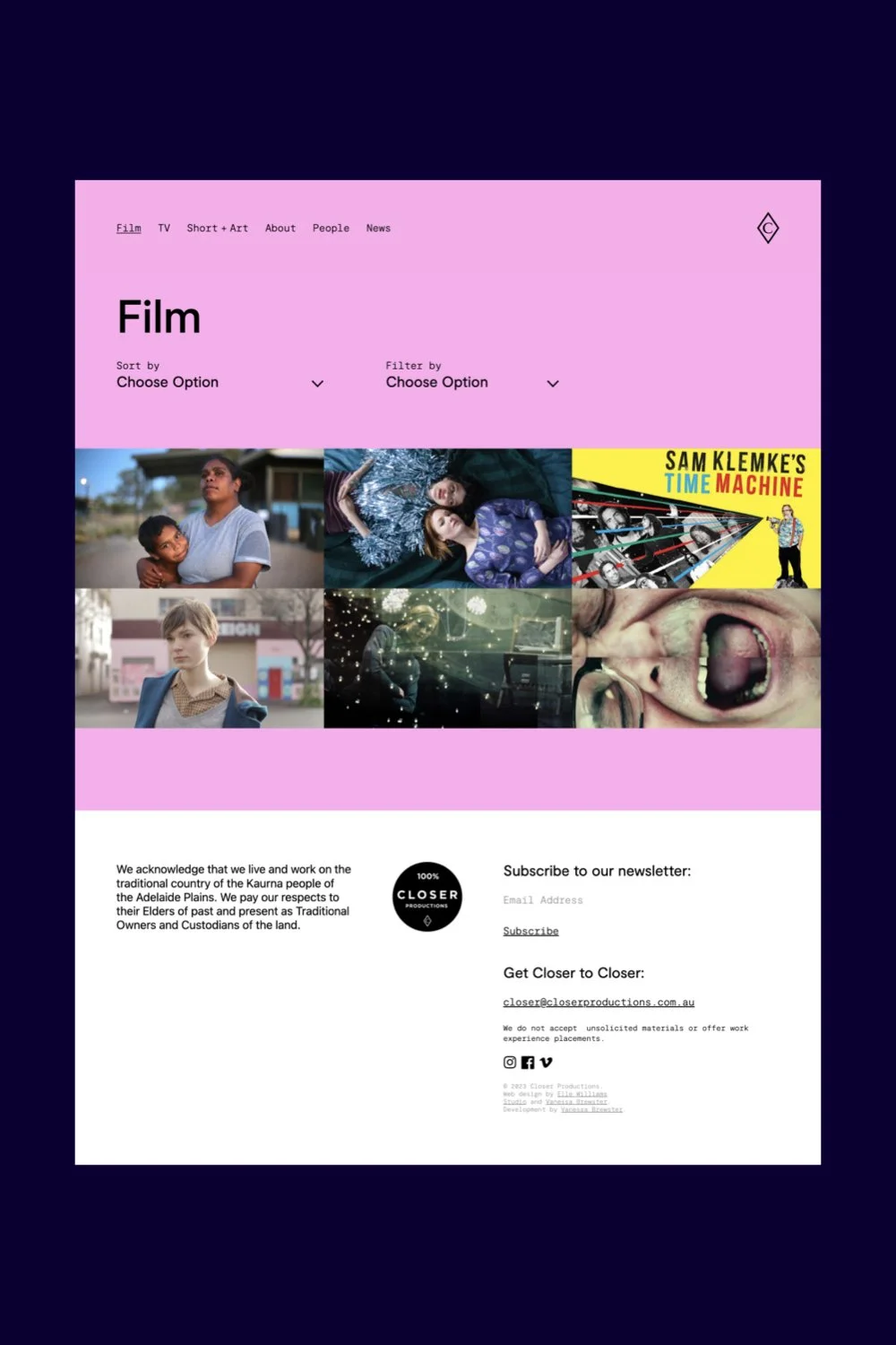
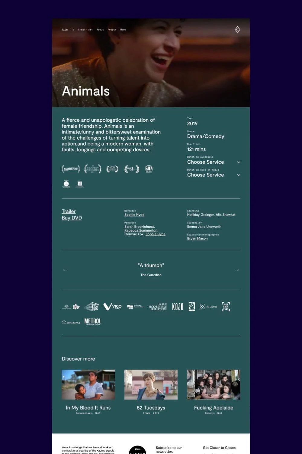
Closer Productions
Closer Productions is an Australian screen production company based on Kaurna Land in South Australia.
Highlights
In their own words, Closer tells “stories that entertain, challenge and provoke; stories that celebrate the wonderful, terrible confusion of being alive; stories that make the heart soar.” The site’s colour palette perfectly matches this mission, bringing their brand to life in fun, vibrant tones balanced with darker, muted colours.
Colours are so crucial to storytelling through moving images. Think about how your website can use colours to create a mood that connects to the soul of your team and brand.
Project pages include relevant, promotional info, leading people to discover Closer’s movies and TV series.
Pages include film festival laurels, streaming service links by geographical location, and autoplaying sections with quotes from critics. These work together to convert visitors into audiences.
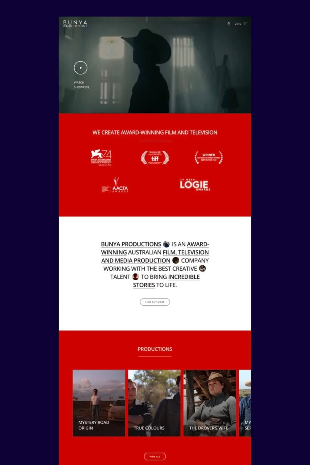
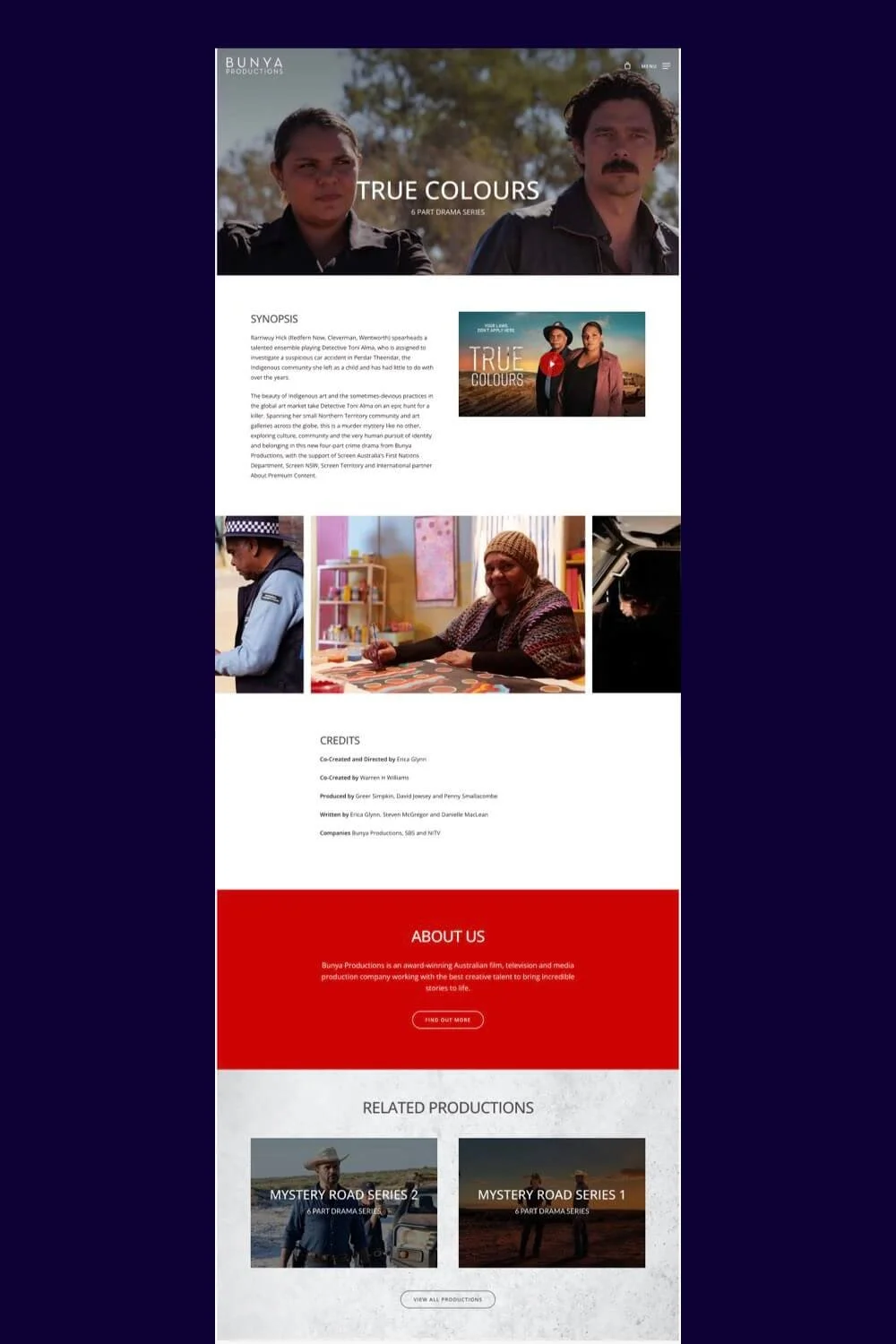
Bunya Productions
Bunya Productions is an Australian film, television and media production company.
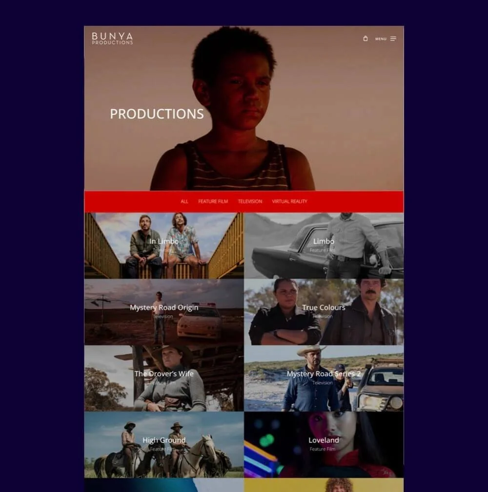
Highlights
Its modern web design backs up Bunya’s credibility as an award-winning production company. Here we see the trends of flat design, large background images, spacious negative space, scrolling text, and horizontal scrolling.
It makes great use of beautiful stills from Bunya’s productions, communicating the company’s reputation for storytelling.
I have to point out the tagline on their homepage too: it’s styled in capital letters, interspersed with tiny images. I’m not sure what name this recent trend goes by, but I personally love it!
It’s a smart, current way to enhance the visual interest of a tagline, and the designer has incorporated links into it to other pages.
Yutopia Films
Established by Yulia Serdyukova in 2019, Yutopia Films is an interdependent film production company in Kyiv, Ukraine.
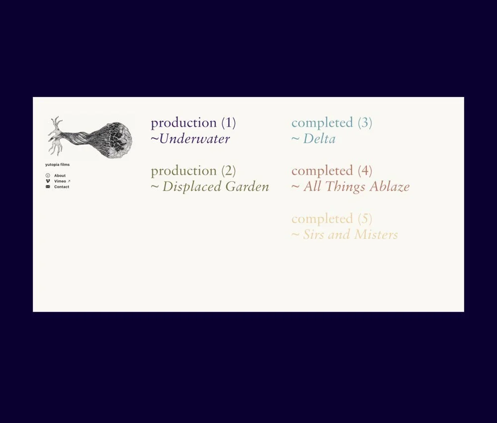
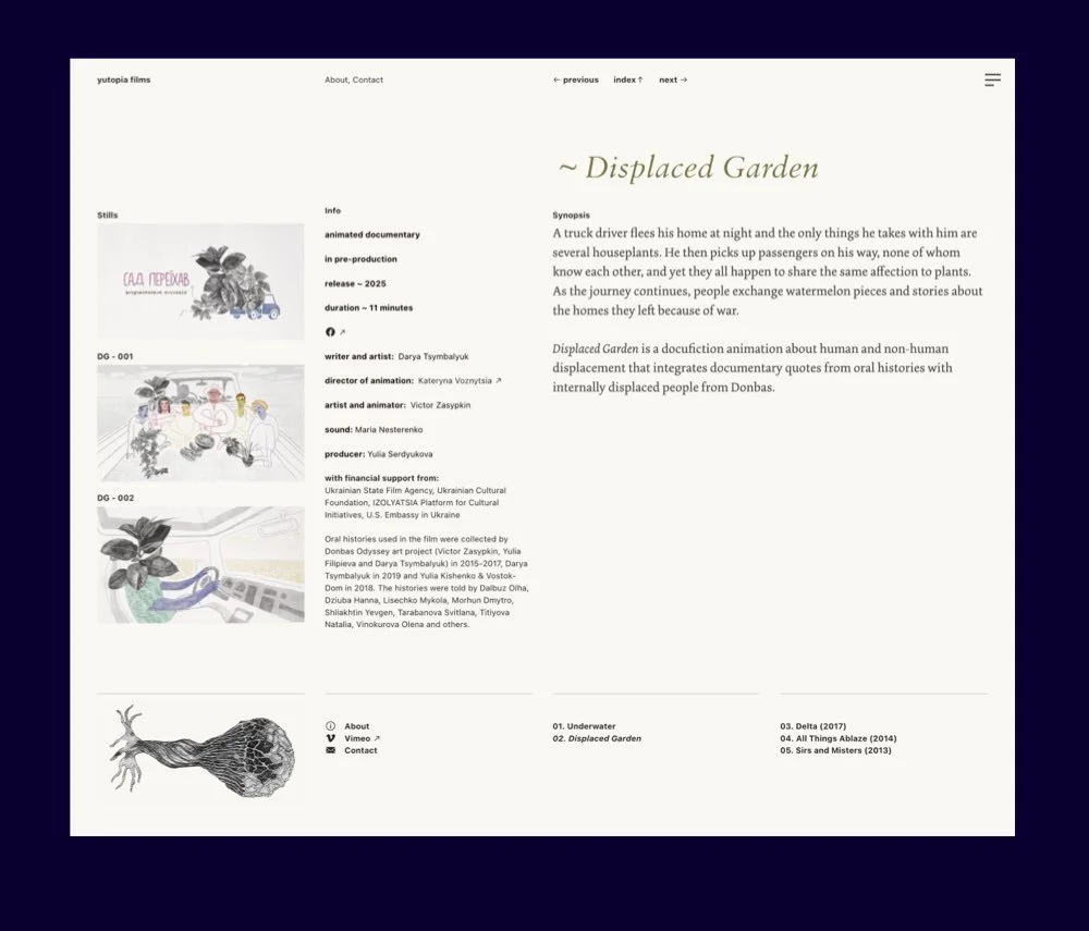

Highlights
A unique, creative design: Film production companies don’t have to follow mainstream web design trends!
Yutopia’s attractive website makes that case in point. The simple homepage consists of an index of the production company’s documentaries, along with its status: completed or in production.
Yutopia Films opts for a soft colour palette, with each film title assigned a different colour. The palette conveys a human-centred approach that befits the documentaries they create and the company’s authorial point of view.
For more colour palette inspiration, see this post.
The website presents info clearly and consistently. For each project, we’re provided with key credits, year, runtime, awards, festivals, a selection of stills, the trailer (where relevant), and a synopsis.
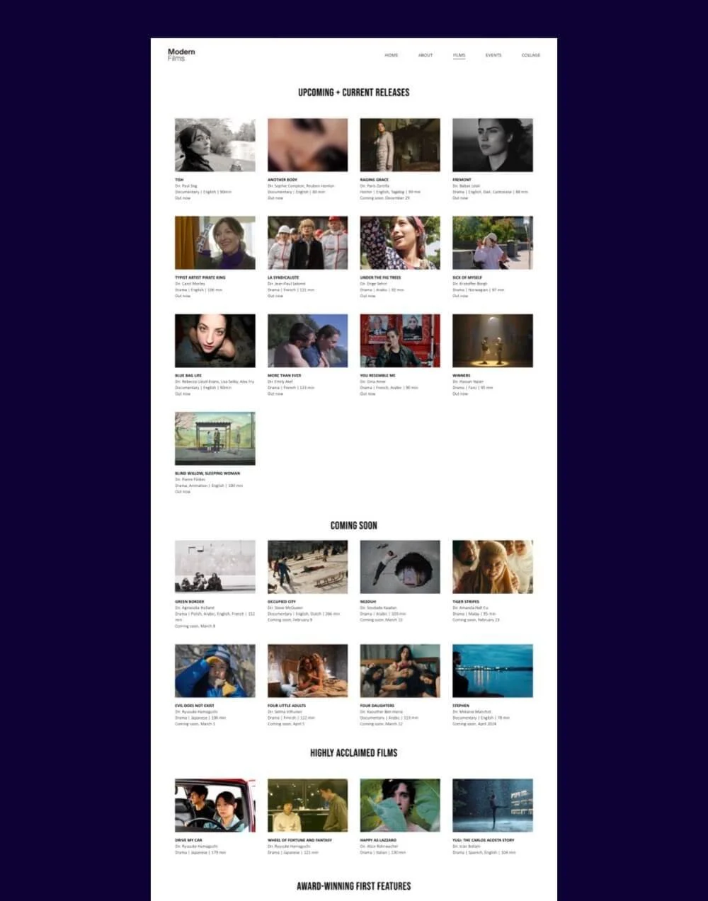
Modern Films
Modern Films is a film production, distribution, event cinema and virtual screening platform company based in London.
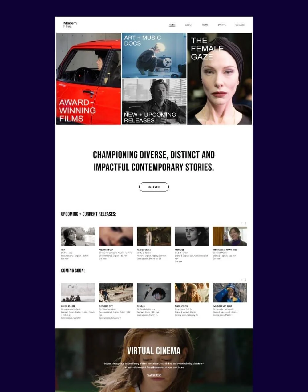
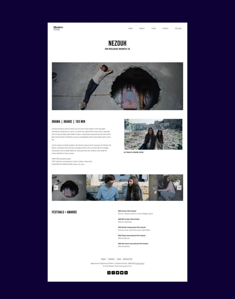
Built on Squarespace 7.1: For those wondering if Squarespace is versatile enough for your production company website, Modern Films is a great example of what you can achieve visually and functionally.
The company has a large line-up of films that are organised in an uncluttered manner using a minimalist aesthetic. A smart choice.
Their site puts the Squarespace summary block feature to excellent use. Summary blocks ↗ allow you to pull content from a collection (e.g. a blog, events) to another area of your site. They allow visitors to quickly browse and access relevant content, improving user experience and engagement.
Observe summary blocks on the homepage and ‘Films’ page, showcasing films in carousel and grid layouts.
The website design seamlessly uses grids of varying image ratios across the site, enhancing visual interest. Which shows that you don’t have to stick to one grid style across your entire site!
I love in particular the grid of very wide images on ‘The Modern Lines’ page. They feel classic and remind me fondly of Mubi.com.


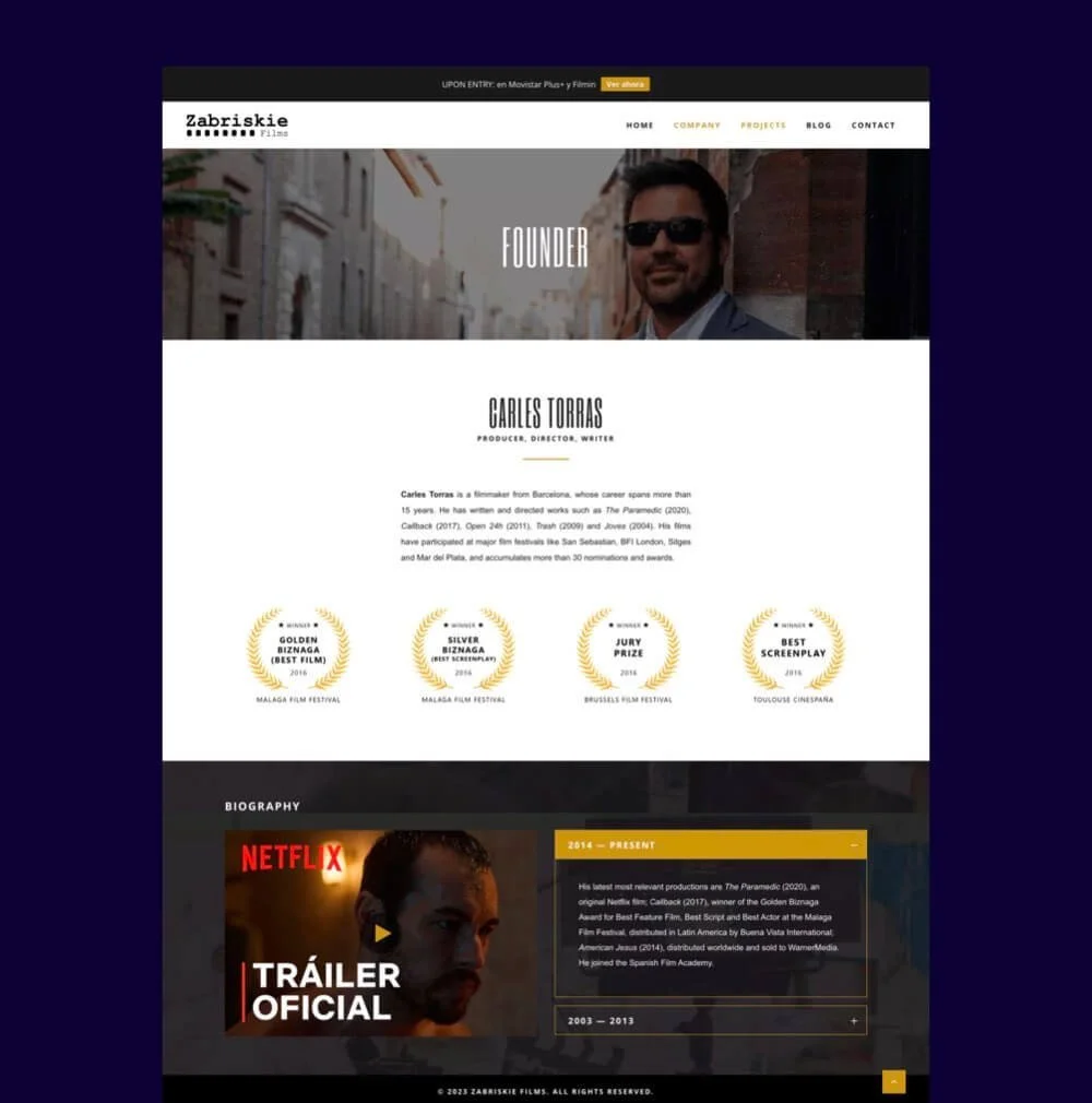
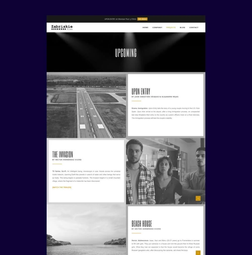
Zabriskie Films
Zabriskie Films is an independent production company based in Barcelona and founded by filmmaker Carles Torres.
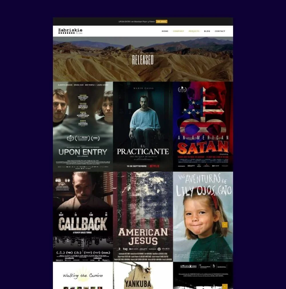
Observe how interactive elements enhance the user experience. For instance, on the homepage, bold film titles appear on hover and follow as you scroll vertically. We also see hover effects on the ‘Released’ page, encouraging visitors to click to explore the films.
Zabriskie Films uses a minimalist 3-colour palette — white, off-black (#2a282b) and an accent colour of dark, warm mustard — giving the site a professional, modern feel.
Another example of the KISS principle (keep it simple, stupid) when you’re organising your projects by page. Projects are divided here into 2 pages: released and upcoming.
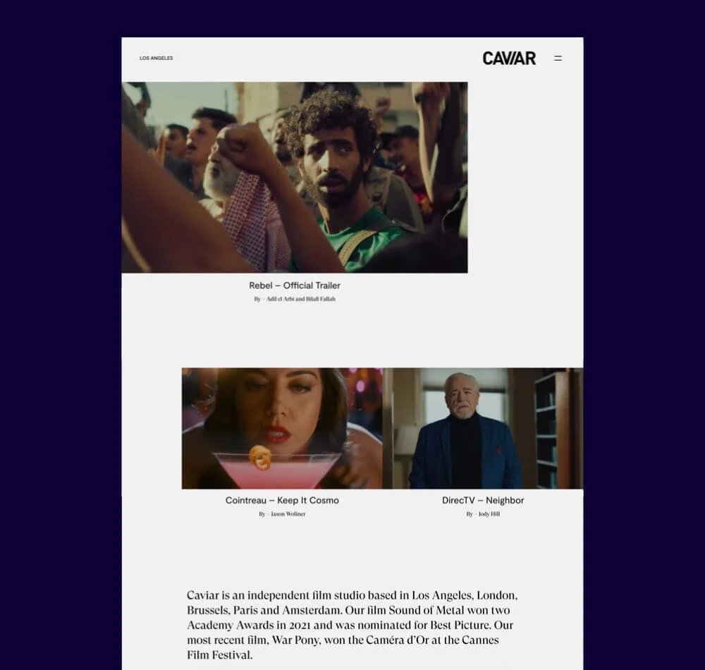
Caviar
Caviar is an independent film studio based in Los Angeles, London, Brussels, Paris and Amsterdam. They work across scripted and non-scripted film and television, advertising, photography and music videos.
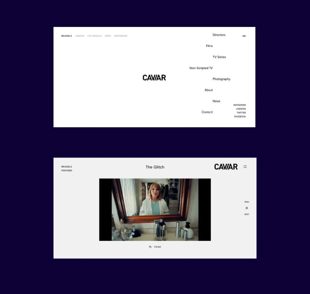
Highlights
Caviar’s website impresses with sleek hover effects, animations (check out that menu!) and autoplaying videos. The latter is a popular web design trend that isn’t always pulled off successfully, in my humble opinion.
If you’re bombarding visitors with too many videos at once, it can be a far more distracting than enhancing user experience.
Caviar pulls this trend off by limiting autoplay videos to up to 2 at a time.
The design effectively uses asymmetry to guide and capture visitor’s attention as you browse through their projects. This works beautifully with the site’s black and white colour scheme, providing a spacious canvas for the film studio’s vibrant work.
Smartly organised: Being one of the bigger companies on this list, the horizontal navigation bar organises the site first by office location. The hamburger menu then gives you options to learn more about the work of each office.
A24
A24 is an American independent entertainment company specialising in film and television production, as well as film distribution.


Highlights
I’ve long admired the web design of A24’s website. Somehow it manages to stay ahead of the curve, while looking effortlessly cool with a hint of nostalgia all at once.
The attention-grabbing homepage top banner promotes recent work. Hover over a title and the still image will be replaced by a video/gif from the film/series, enticing visitors to click to learn more.
The site uses a large type scale to establish an effective visual hierarchy and to improve readability. Font sizes range from big text that makes a bold statement to text much smaller in scale, yet capitalised to still catch visitor’s attention.
To wrap up today’s post, the modern websites showcased here not only promote fantastic work, but also represent the distinct brand identities of each production company – the values that drive them to make movies.
These sites serve as a testament to the power of web design in capturing the essence of a production company’s brand, enhancing its reputation and creating an engaging user experience.
As you've explored these inspiring examples, I hope they have sparked your creativity in your own web design endeavours!