Editor Brendon Chan
Platform
Squarespace
Client
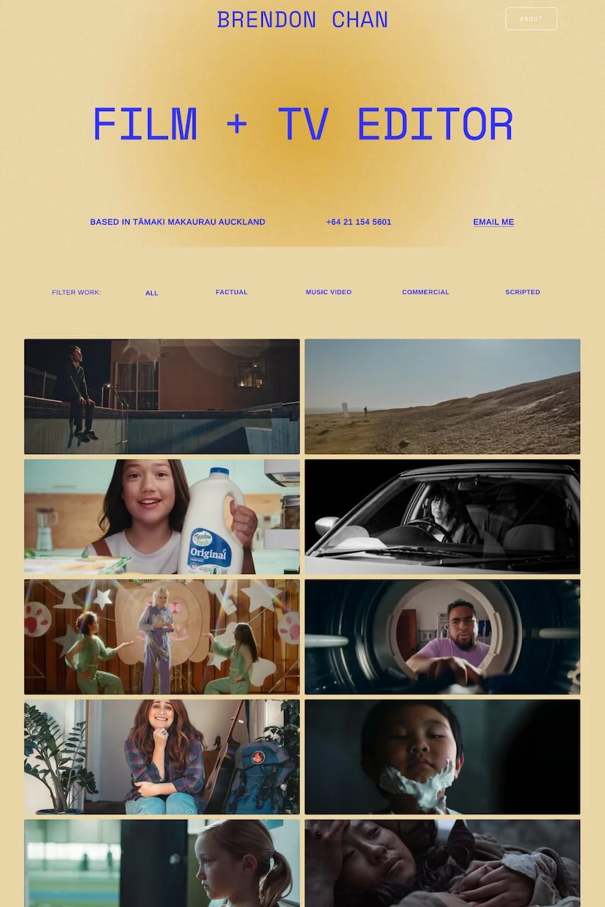
Brendon Chan — Film + TV Editor
When I started working with film/TV Editor Brendon Chan, he thought the appearance of his old website didn’t really reflect who he is. Sharing a common aesthetic with many other filmmaker websites, it lacked a visual identity and didn’t stand out.
The old website
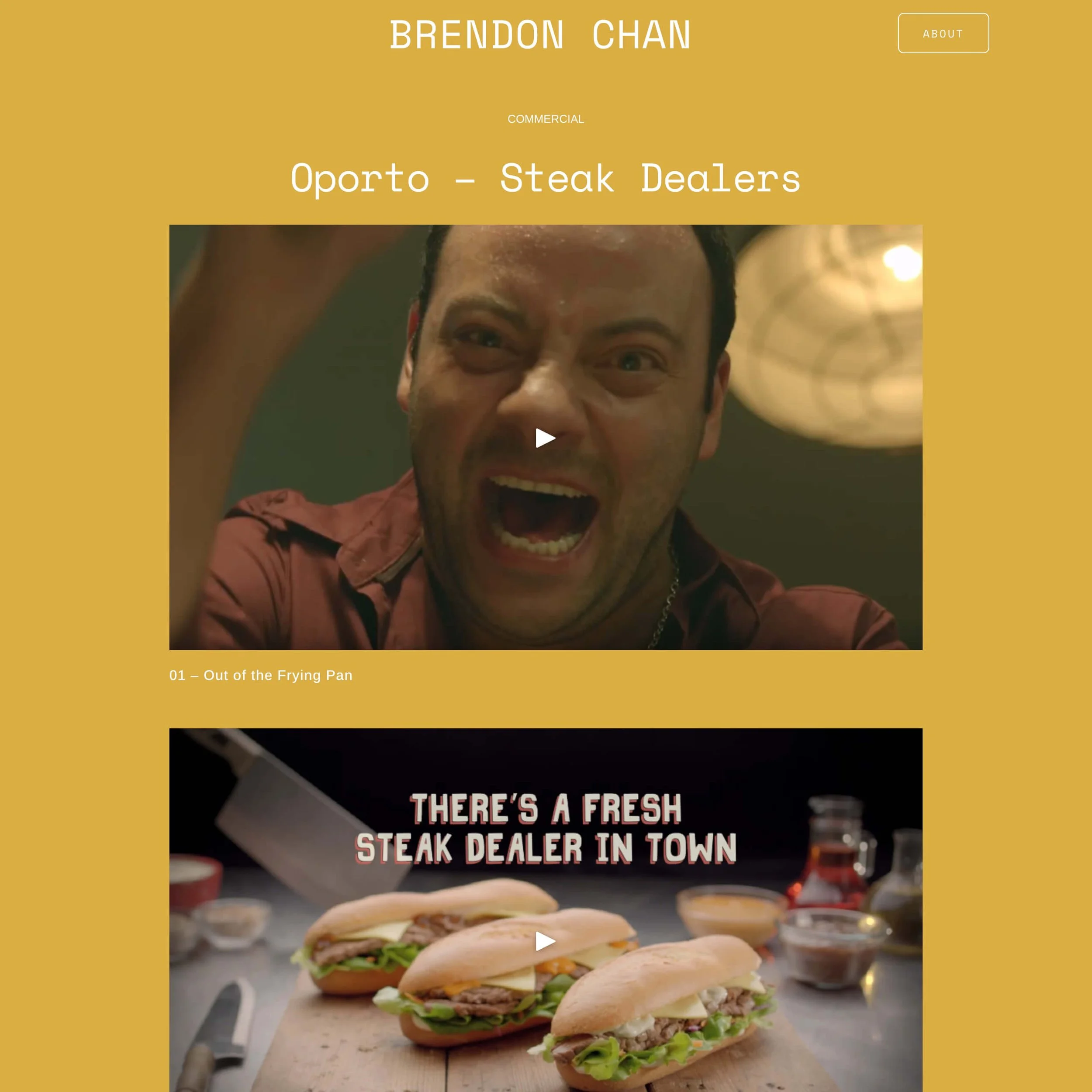
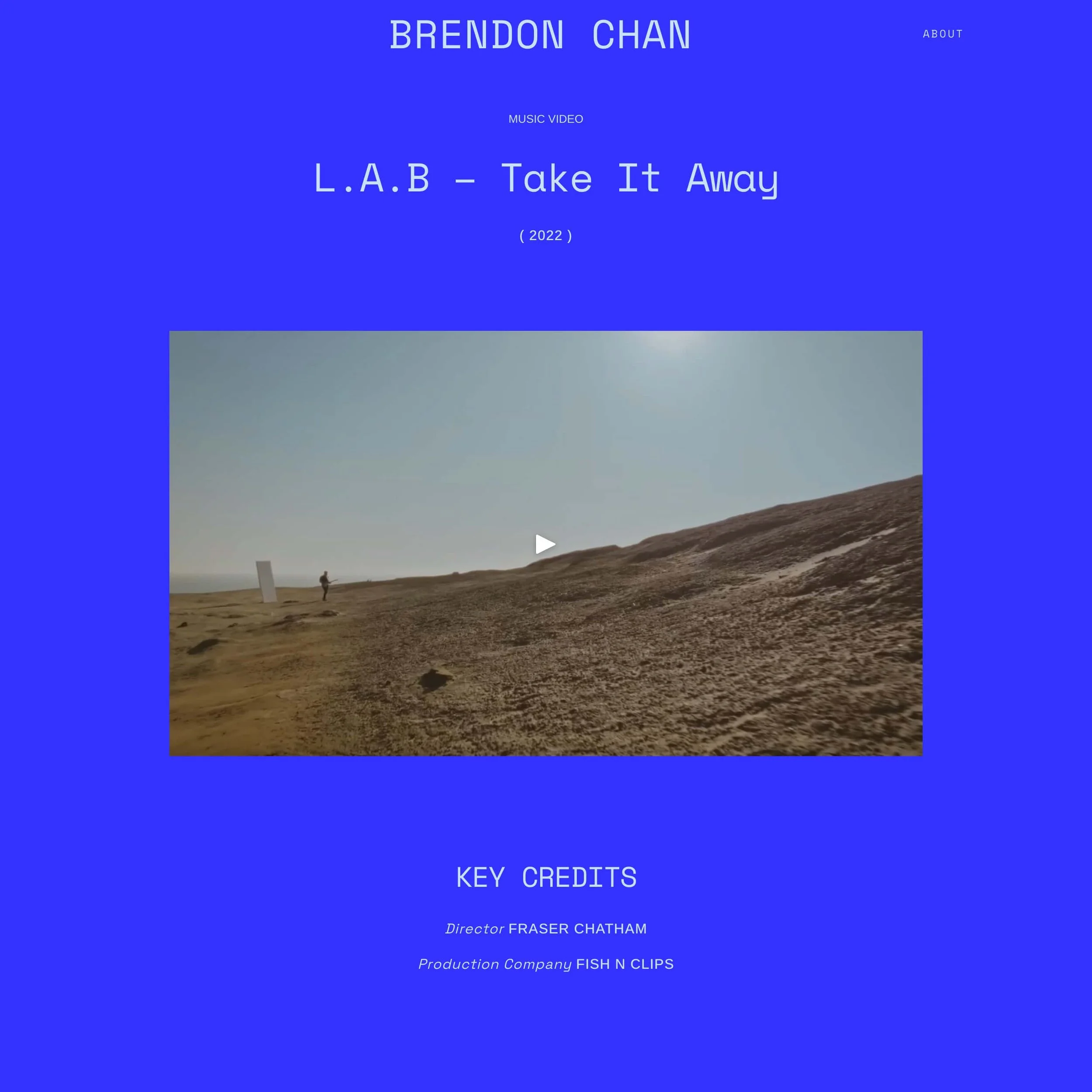
Brendon wanted his portfolio to engage visitors with a hover effect. I explored what we could achieve with custom CSS, eventually developing a hover effect so that a mustard tile with essential info about each project would replace its image when hovered over.
This led me to look for the right colours for the tile – colours that would be both inviting and easy to read. I wanted to design an overall colour palette that would reflect Brendon’s character, and was inspired by his comment that he tries to always be a positive voice in the edit suite whenever a director/producer feels lost or worried.
I found inspiration in colour gradients, eventually landing on warm, yellow tones balanced with cooler blues that I mixed with a film grain effect. In addition, I designated each project category a different colour theme.
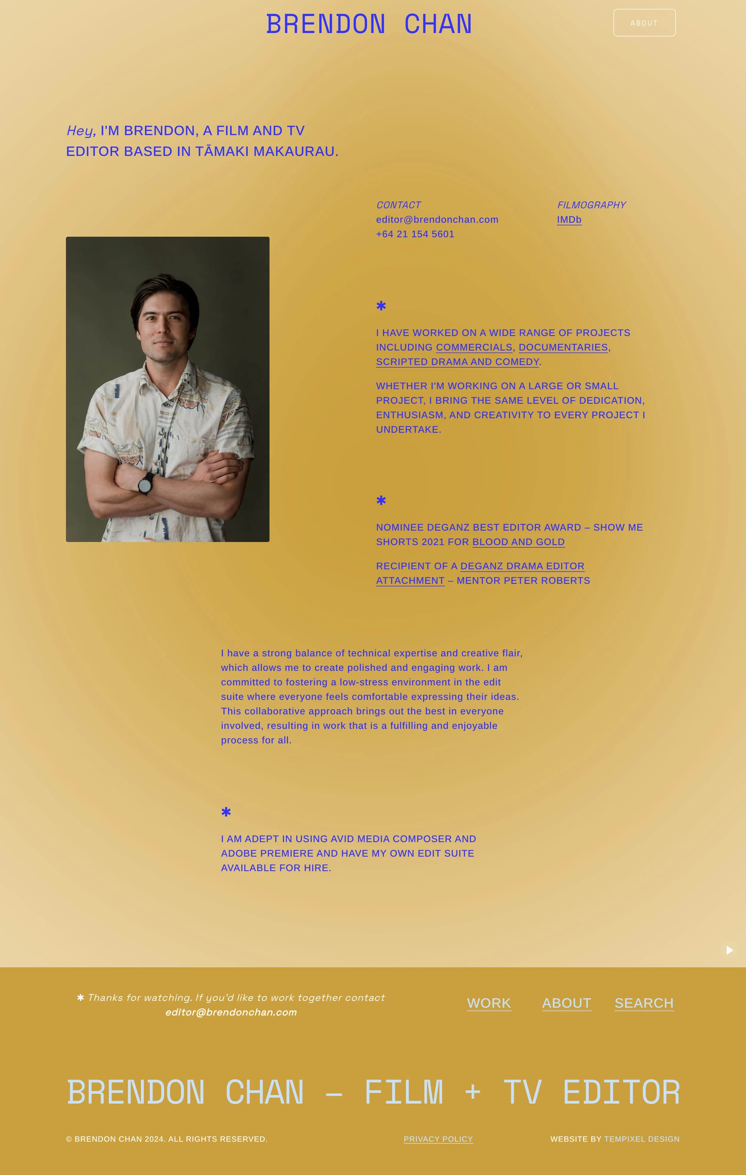
About page
“I think Tema has great intuition. Not only for design, but also in applying it uniquely to every individual she works with. I didn’t think that someone could talk to me, look at my work and distil it into a visual representation of my career. I think it’s an accurate representation of how I see myself and my portfolio.”
