8 Acting Coach Websites to See Before You Build Your Own
In August last year, I set out to discover the best acting coach websites I could find in terms of design and content.
Specifically, I wanted to research personal websites of solo coaches, and excluded from this search acting institutions and larger acting studios—those that had multiple teachers.
I performed searches for coaches all around the world—from Australasia to Europe, North America to Asia. But my optimism swiftly drained as my search dragged on… and on.
Here are a few things that became quickly apparent.
First, a lot of solo coaches are building their own websites.
Secondly, it is really hard to find exemplary websites among acting coaches 💔. Everyone deserves good design, not least of all acting coaches, who provide wonderful support and training to our acting community.
I found many sites lacking in some area, whether it be branding inconsistencies or outdated design trends. I was so surprised how many sites lacked a browser icon that I’m publishing a tutorial later this month on a sure-fire fix for Squarespace sites.
And lastly, fun fact, blue is the most popular colour choice for acting coaches. I suspect many gravitate subconsciously to blue for its associations with trust, serenity and security.
Months later, I’m able to share the best acting coach sites that I could find after browsing over a hundred websites (literally).
Acting Coach Websites:
Kennedy Brown - Squarespace
Erin Wilson Studio - Showit
Gary Condes - Squarespace
Vance Barber - Wix
Julia Martin - Squarespace
Kieran Vyas - WordPress
Tom O’Brien - WordPress
Helena Walsh Empowerment Studios - Kajabi
Kennedy Brown
First up, let’s take a look at the Squarespace website of Kennedy Brown, an acting coach based in Los Angeles.
Highlights
On the homepage, the first two sections contain quotes that introduce us to Kennedy Brown’s coaching philosophy—this is a great idea. Most actors will be weighing up if your teaching style/method is right for them, so be sure to share that information in places that are easy to discover.
Beautiful, black-and-white photographs of Kennedy working with his students gives visitors compelling insight into what to expect as a student. These professional stills are used as the background for page headers, calls to action and a stunning homepage testimonial section. Getting professional, high-quality photos for your website are well worth the investment.
If you’re thinking about offering an online course to your acting community, this is an example of a member site that leverages Squarespace Courses ↗, which are included with every website plan.
Design Tips
As a web designer, I always try to avoid full-width blocks of text, which are harder to read or skim. Dividing copy into two columns, instead, facilitates a better reading experience.
The site’s elegant and polished branding doesn’t extend to the course graphics used on the Courses & Workshops page. But if it had, it would have made the brand even stronger. Design consistency is an important part of establishing your brand—apply it to all of your marketing assets, not just your website.
Erin Wilson Studio
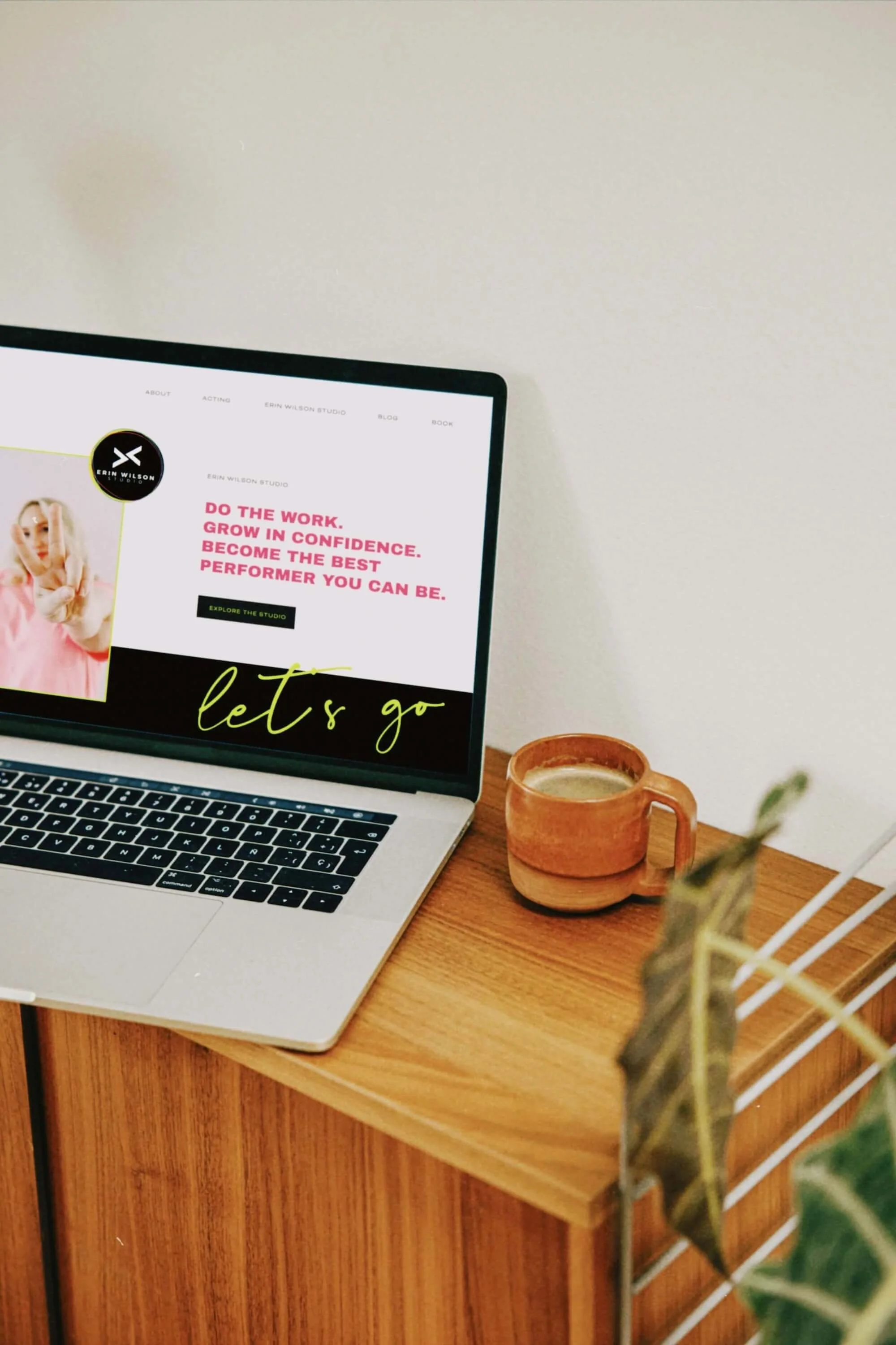
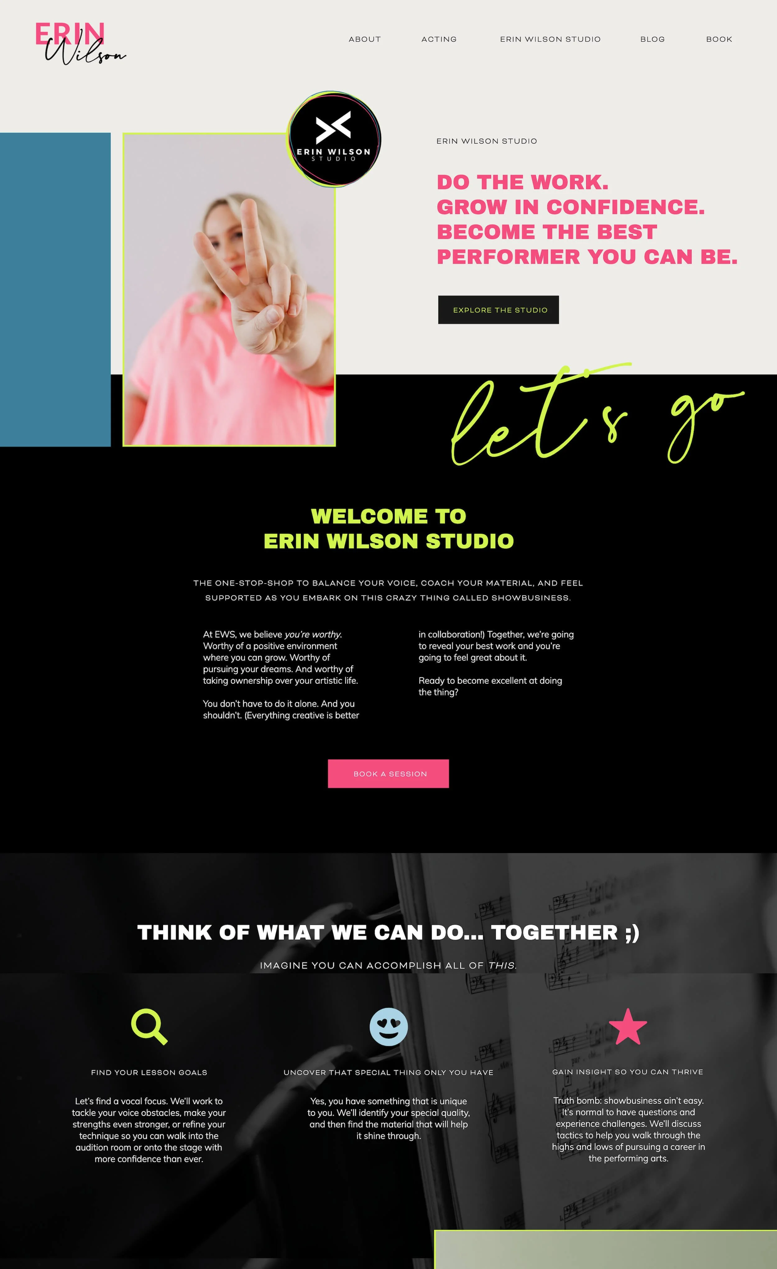
Erin Wilson uses her Showit website to promote her services both as an actor and coach, with a special focus on vocal training.
Highlights
With its vibrant colour palette, photography, animations and uplifting language, the Erin Wilson Studio website creates a positive vibe. When designing your own site, consider the emotion(s) you want visitors to experience—whether it's excitement, trust, or something else.
This website is a great example of how to design and balance a wider colour palette. The site incorporates accent colours of blue, pink and yellow, while neutrals (black, grey and white) help to differentiate sections and keep the focus on key elements like text, images, or calls to action.
Design Tips
Simple animations can add a fun and dynamic touch to your web design, but be careful that they don’t distract from more important elements. E.g. I recommend not placing auto-transitioning images near key text, as constant movement will pull attention away from your message.
Gary Condes
Gary Condes is a London acting coach. His website, built on Squarespace, markets his work as a teacher, coach and director.
Highlights
Gary Condes’ website feels very personable thanks to the way he weaves in the use of the first person. First person is a natural fit for acting coaches, helping you to form a personal connection with the actors you wish to reach.
He also writes clear calls to action that communicate the steps an actor needs to take next if they’re interested in his courses or coaching. For example:
“If you would like to know more about my 121 Coaching, please get in touch with a brief explanation of your acting training and experience, where you’re currently at with it all and what you feel you need. I will be very happy to go through your options and find out how we can work together.”
The homepage includes a section where he can promote his latest coaching news. The quality of TV and theatre productions he’s helped actors prepare for speaks volumes through the inclusion of images. Additionally, each news item is only a couple of sentences long but gives us insight into his involvement.
Design Tips
You can use summary blocks in Squarespace to create a featured newsfeed on any page of your site.
Avoid displaying testimonials as pure images, since these aren’t accessible to visitors with visual impairments. It’s best to keep important copy—like testimonials—as text. If you must use images, include the full testimonial in the alt text, so screen readers can convey your message.

Vance Barber
From top to bottom, the single-page Wix website of acting coach Vance Barber clearly presents his personal brand. Let’s take a closer look.
Highlights
An excellent one-page example of how to design the structure and flow of information for visitors on an acting coach website. Make sure to also design a clear call to action at the bottom of the page, like Vance Barber. His site resolves with a section on coaching and how to contact him.
A strong feature of the site’s web design is the use of several portraits in black and white. He made a great choice in investing in a photoshoot. Not only do these images establish a strong visual presence, but give Vance the appearance of being friendly and professional.
His brand voice is distinctive—direct and to the point. His copy features short sentences, and headings that end with a decorative full stop.
Design Tips
While I like the conciseness of his copy, I’d generally recommend including more written content giving insight into your approach / the acting techniques that you teach. Vance is an associate of Bob Krakower—a name new to me as somebody outside of America—but who I’m guessing is a famous acting coach. If you don’t have the benefit of being associated with a well-known brand, imagine how you might talk to an actor face-to-face who has never crossed paths with you before.
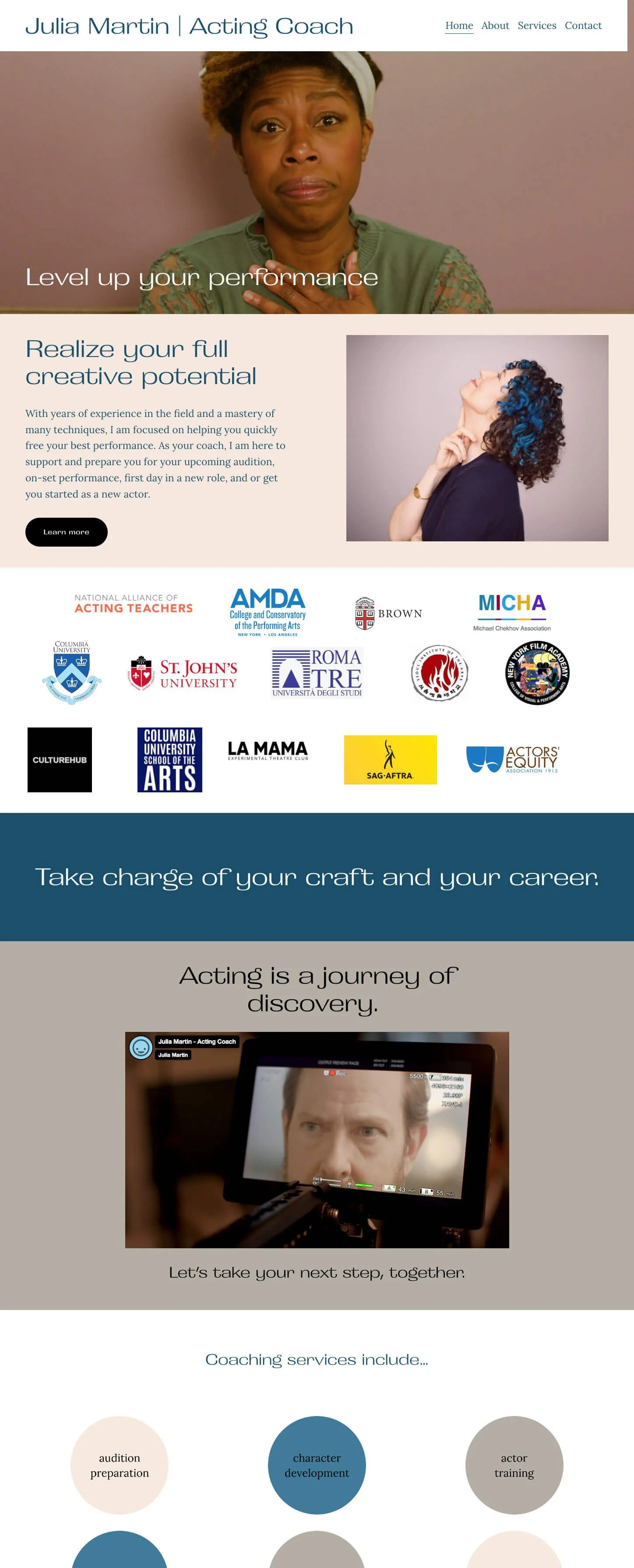
Julia Martin
Julia Martin coaches actors in New York City and on Zoom. Her acting coach website is a two-page Squarespace website.
Highlights
Your website exists to promote you. Julia includes a promo video on her homepage, which is a lovely introduction to her and her coaching services. A section of that video is also used as a full-screen video background at the top of the homepage, grabbing our attention from the get-go.
The site’s main call to action—contact Julia—is included as a section at the bottom of each page. This is really good practice if you want a website that converts visitors into clients.
A great choice of brand colours, precisely because the blue and natural tones seem to capture Julia’s personality. The blue matches the blue streaks in her hair!
I like how instead of going with the obvious choice of listing her coaching services as bullet points, these are expressed visually as coloured circles. Due to shape psychology, this circle arrangement invokes a calming effect on the viewer.
Design Tips
When including a collection of industry logos to build trust and credibility, be sure to include a heading that gives us context and avoids confusion. On Julia’s website, for instance, has she worked with SAG-AFTRA or is she a member?
Even designers find it difficult to arrange logos of different shapes and sizes. Here’s where taking the time to prep and size each image using your design tool of choice will help you out.
Kieran Vyas
Kieran Vyas is a director, filmmaker and acting coach based in Leicester and London.
One of the larger sites on this list, it’s built using probably one of the best WordPress themes out there, Enfold by Kriesi ↗. Because I used to maintain a site built with Enfold, I can always spot it in the wild!
Highlights
Kieran Vyas’ website is well-organised and easy to navigate. A multi-hyphenate, he’s made a clear distinction between his coaching and his directing, with separate pages and blogs for each.
There’s consistency across the website’s design. For example, headings have a visual hierarchy, and we can see consistent styling has been applied to testimonials and page headers across Kieran’s service pages.
I like that he keeps a blog to share interesting content. One is called The Actor’s Library covering resources, industry interviews, guidance and tips for actors and creatives. And he has a Recent Work blog where he shares news about his filmmaking projects.
Design Tips
Adding a blog to your site can help you boost its marketing potential. Blogging not only provides valuable content for your audience but can help your site rank higher in search results. Like Kieran, you could publish interviews with actors and other filmmakers in your circle. Plus, it’s a great excuse to have a yarn with another creative!
Tom O’Brien
Next up is the WordPress website of acting and performance coach Tom O’Brien.

Highlights
A fine example of a well-designed and comprehensive personal website. However, I want to draw special attention to the structure of his courses pages, if selling online courses is something you’re interested in. These pages include course overviews, testimonials, reviews, info on Tom O’Brien, and FAQs.
The website’s branding consistency is excellent. Notice how the same visual style and tone of voice is carried across the whole site and across all media, including blog images and the trailer for his digital acting course.
Design Tips
To create a consistent brand when designing your website, create a hidden page where you can play around with and decide on the fonts and colours, style and tone. Once established, you can refer back to this style guide when adding new content to your site.
Adding on to the above tip, consider setting up branded templates for social media and blog assets in the design programmes you use. This is also a great time-saver.
Helena Walsh Empowerment Studios
Here’s a great example for voice and acting coaches looking for web design inspiration for a landing page or sales page. Helena Walsh has a dedicated landing page for each of the courses that she offers.
Highlights
Content is king when designing a landing page or sales page. Take a look at this page for ideas on what sections you’ll need, such as FAQ and modules sections, and how to structure your page.
It’s good practice for landing pages to include one call to action with multiple buttons for that CTA. In this case, Helena’s goal is to encourage visitors to apply for her acting course. She uses several buttons down the page, worded differently to help her achieve higher conversions. E.g. “Yes, I need this” and “I’m in”.
