9 Tone-Setting Squarespace Colour Palettes for Filmmakers
One of the most effective—and dare I say easiest—ways to leave a strong and memorable impression with your website is through a well-chosen colour palette.
I’m delighted to present 9 curated colour palette ideas for directors, cinematographers, producers, and other film professionals in today’s post.
Designed specifically for filmmaker websites, these 9 palettes won’t detract from your images and videos, which are often the focal point of a film and TV portfolio.
First, I’ll cover how to set up your colour palette the right way in Squarespace 7.1.
And towards the end, I’ll share my top tips for website beginners on web accessibility and navigating black and white.
This post covers:
✌️ Building your own website? Grab my free, unbranded Squarespace website template for filmmakers—the perfect canvas to create a job-winning portfolio.
How to set up your custom Squarespace colour palette the right way
Before we crack into our box of colours, it’s helpful to start with an understanding of how Squarespace colour palettes work in version 7.1, if you’re going down the custom palette route.
If you already know how to set up your palette the right way, feel free to jump to the 9 palettes 🐰.
What makes up a Squarespace colour palette?
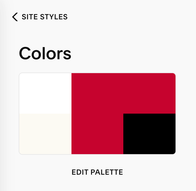
Squarespace gives you the option to add 5 colours to your website’s site-wide colour palette. You can find this palette under your Site Styles.
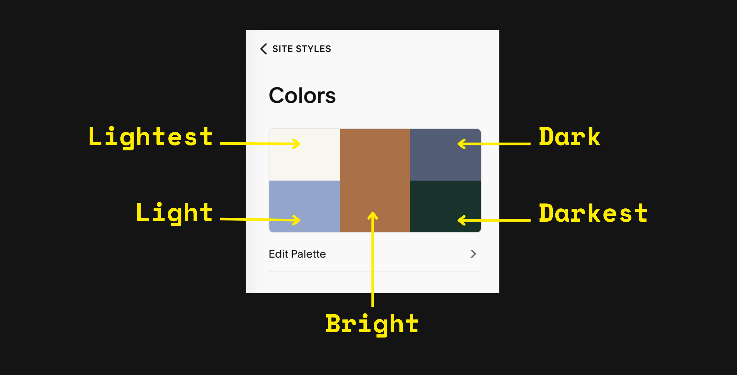
Disclaimer: these are my labels, as I couldn’t find if Squarespace has official terms or not.
Let’s dive into each colour:
Lightest colour — choose pure white or a shade that slightly differs from white. I suggest only using this colour for foreground elements, like your web copy.
Light colour — I like to think of this colour as your preferred light background colour. A pastel, light shade or light grey can be good choices here.
Bright colour — generally, this middle colour is for accents, e.g. buttons or call-to-actions. If you're going for a monochrome palette (like Tempixel’s website), input your statement colour here.
Dark colour — I tend to view this one as your preferred dark background colour, e.g. a very dark grey or dark colour.
Darkest colour — I recommend using a shade that is a teeny bit lighter than pure black. See my tips later on for why.
When creating a custom palette for your filmmaker website, arrange your colours from lightest to darkest.
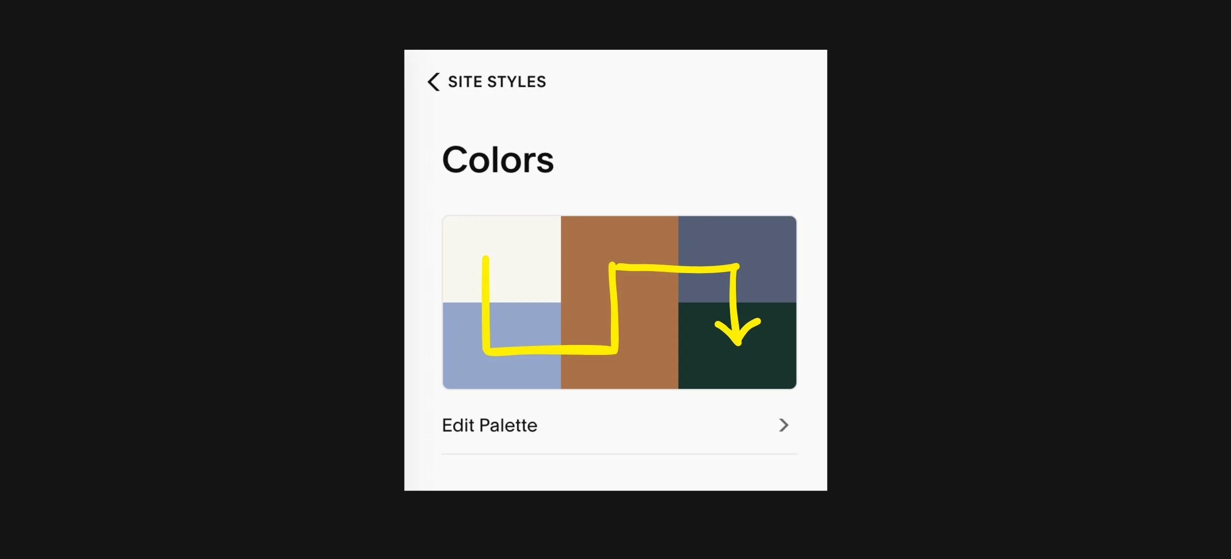
The direction of light to dark is like a snake.
How your palette affects section colour themes
The reason for sticking to this order from lightest to darkest is that it helps SQSP automatically calculate 10 section colour themes using your 5 colours.
To explain the difference between colour palette vs. section colour themes in Squarespace, think of your themes as the different colour combinations that derive from your overall palette.
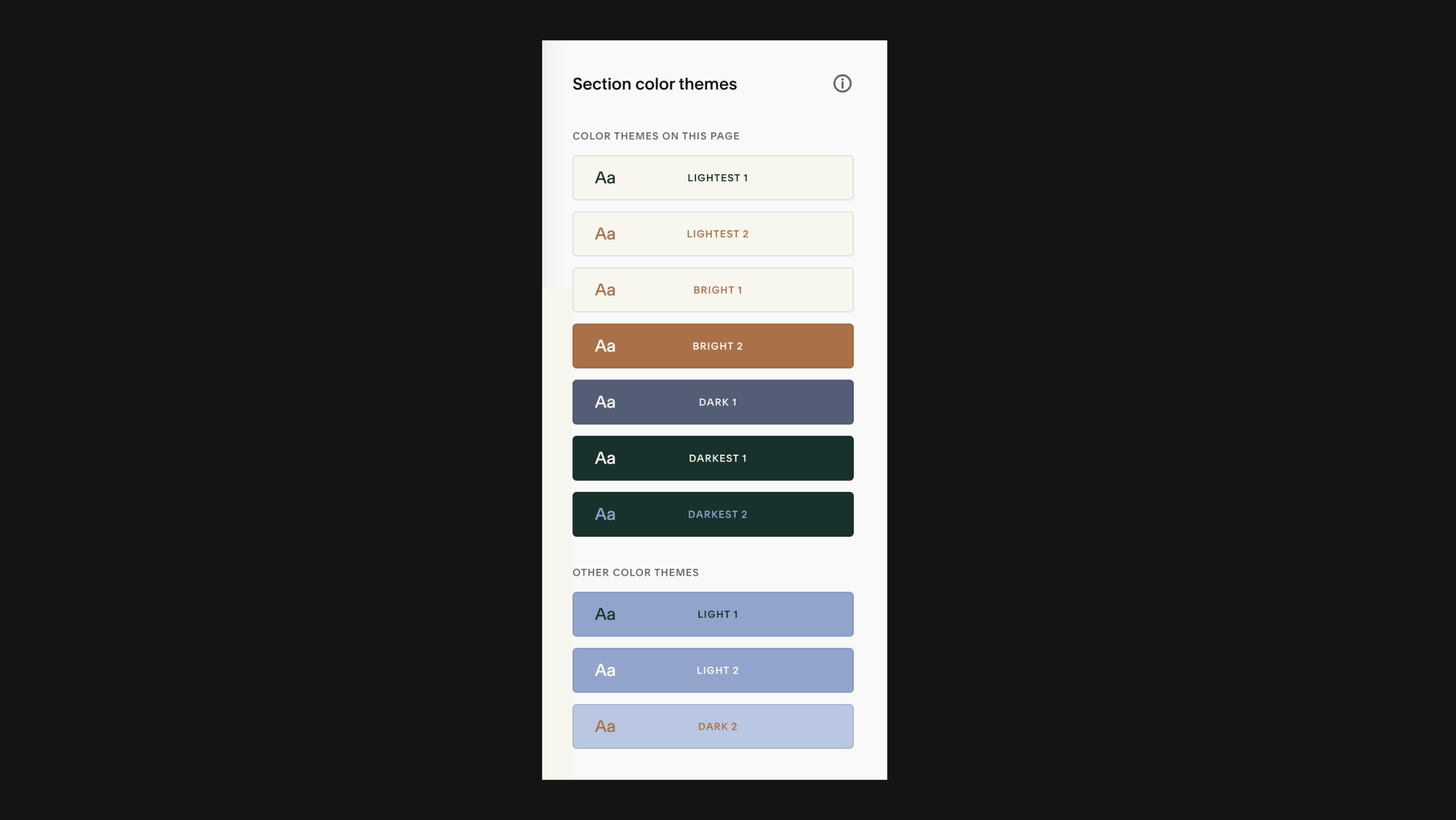
Squarespace will look to pair a light foreground—usually text—with a dark background, and vice versa.
Some colour themes may use 3 colours from your palette. For instance, you may see two different colours applied to headings and paragraphs.
Squarespace’s theme calculations aren’t perfect, though, but the order from light to dark means you shouldn’t have many manual changes to make to your colour themes later.
A piece of advice: Don’t bother with making manual changes to all 10 section colour themes. Just edit the themes that you will use.
Typically, I might design with 3–5 section colour themes, and I’ll disregard the rest.

9 tone-setting Squarespace colour palettes for filmmakers
It’s time to explore our 9 colour palettes! Each has been thoughtfully selected with filmmakers in mind, so the colours won’t clash with videos or stills on your page.
General notes
I’ve applied each idea to our Moulin Squarespace 7.1 template ↗, presenting 2–3 section colour themes (out of 10) from the colour palette.
You’ll be able to see what order to input the colour scheme into Squarespace 7.1—simply copy and paste the HEX codes, including the # symbol.
The majority include a white and black in the lightest and darkest spots, even when white/black is not used in the final design. However, these are included as a backup for text, as per SQSP’s recommendations, meaning that if readability is poor, increase your contrast ratio by using the lightest or darkest colours.
In most cases, I had to make some manual adjustments to my chosen colour themes, e.g. changing the colour of text styles and links.
Unless noted, these colour themes meet the minimum contrast ratio of 4.5:1 for web accessibility. If web accessibility is new to you, see the bottom of this post for an introduction.
Let’s begin!
📌 If you’re building a website mood board, save your favourite palette ideas to Pinterest. Just hover over a palette and click Save!
Light + Youthful
Are you after a light and youthful vibe for your online portfolio? You might like this colour palette, which combines greys with pastel yellow.
Lightest colour: #FDFDFD
Light colour: #F0F0F0
Bright colour: #EDF07B
Dark colour: #0B0B0B
Darkest colour: #OBOBOB
Mature + Inviting
Since 2000, colour experts at the Pantone Color Institute™ have tapped into the zeitgeist around the world ↗ to forecast one colour to encompass the new year.
For 2024, the Pantone Colour of the year is PANTONE 13-1023 Peach Fuzz ↗ (#FFBE98), a gentle and warm pastel situated between orange and pink.
In seeking a hue that echoes our innate yearning for closeness and connection, we chose a colour radiant with warmth and modern elegance. A shade that resonates with compassion, offers a tactile embrace, and effortlessly bridges the youthful with the timeless.
— Leatrice Eiseman
Executive Director, Pantone Color Institute™
Needless to say, I had to try my hand at designing a Squarespace colour palette with Peach Fuzz.
The palette I landed on pairs Peach Fuzz web copy with warm grey and dark brown backgrounds that will give any filmmaker portfolio a sense of maturity, warmth and invitation to collaborate.
Lightest colour: #F4F4F4
Light colour: #FFBE98
Bright colour: #3F1B0C
Dark colour: #565656
Darkest colour: #000000
Playful Yet Grounded
Yellow takes up the Bright, middle spot in our next idea, breathing optimism into this distinctive website colour palette. This is a great option if you’re seeking to convey a mood that’s grounded, yet playful and unique.
For some reason, this colour palette—particularly the yellow and timbre colour theme—always gives me Wes Anderson vibes!
Lightest colour: #FFFFFF
Light colour: #FBFAF3
Bright colour: #FFE32E
Dark colour: #696649
Darkest colour: #000000
Chill + Understated
I shared an example of this website colour scheme on our Pinterest ↗ earlier this year, and it’s proven quite popular! Combining a muted blue (#586E84) with white smoke (#F5F5F5) and a tinted brown (#E2D9D0), this palette gives off notes of understated sophistication and calm.
If you want your film portfolio to feel effortlessly stylish—hello chill vibes—this palette is an excellent choice:
Lightest colour: #FFFFFF
Light colour: #F5F5F5
Bright colour: #E2D9D0
Dark colour: #586E84
Darkest colour: #141414
Comforting + Refreshing
Here’s another colour palette composed of blue tones. It brings together dusky and deep shades of blue with a complementary pastel orange.
This website colour scheme produces a mood that balances comfort and warmth.
Lightest colour: #FDFDFD
Light colour: #FFDA9F
Bright colour: #526289
Dark colour: #182A47
Darkest colour: #0B0B0B
Gentle Confidence
Our next Squarespace colour palette for film creatives could be described as gently confident. Not shy of making a statement, yet doing it with modesty and kindness ☺️. If that’s your jam, you’ll like this palette:
Lightest colour: #FFFFFF
Light colour: #E6CFFF
Bright colour: #E66D4C
Dark colour: #161C23
Darkest colour: #141414
Electric + Fantastical
The first word that comes to my mind when looking at a site in this colour palette is electric. I especially love the vitality and novelty of #7EFC9F light green, which generates an undercurrent of creative power!
This colour palette is a great option for filmmakers working in the fantastic genres, including science-fiction, fantasy and thrillers.
Lightest colour: #FAFAFA
Light colour: #7EFC9F
Bright colour: #236871
Dark colour: #081F26
Darkest colour: #0B0B0B
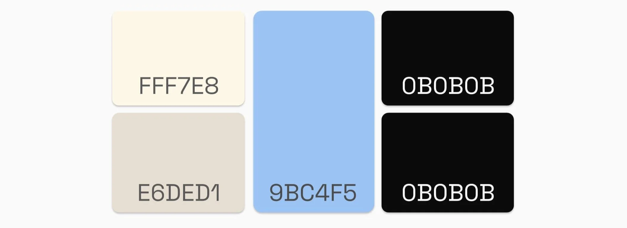
Classic + Calm
If you’re more inclined towards a black and white palette—a widely popular choice among filmmakers—adding an accent colour can give your online portfolio an edge.
Bringing together warm neutrals, night black and a serene, pastel blue, this colour combo will leave your website visitors feeling calm and at ease.
Lightest colour: #FFF7E8
Light colour: #E6DED1
Bright colour: #9BC4F5
Dark colour: #0B0B0B
Darkest colour: #0B0B0B
And yes, the double up of the darkest colour is intentional. This palette only requires 4 colours. Alternatively, you can drop the Bright colour in both the Bright and Dark positions.
As you can see in our website examples above, I’ve applied the Bright colour (pastel blue) to certain elements, such as the Site Header and ‘Watch now’ button. Likewise, you can adjust your colour themes to strength the hierarchy and harmony of your site’s design.
Solid + Nostalgic
Last but not least, our final colour palette is another alternative to black and white. The colours of dark grey (#171717) and almond (#DECFC2) evoke a tactile familiarity that feels a touch nostalgic.
I’ve also added in rust (#AC4606) for a Bright colour, suitable for buttons and large text/call-to-action. However, do avoid using this colour for normal-sized or paragraph text, as it fails the Web Content Accessibility Guidelines (WCAG) 2 for normal text.
Lightest colour: #FFFFFF
Light colour: #DECFC2
Bright colour: #AC4606
Dark colour: #171717
Darkest colour: #111111
📌 Don’t forget to click the Pinterest save buttons in the top left corner of your favourite colour palette ideas!
Colour picking Q&A
Is there a process I can follow for customising my Squarespace colours?
To make the Squarespace colour customisation process easier, I recommend making changes in this order:
Colour palette
Colour themes
And if desired, colours of individual blocks, e.g. web copy and shape blocks.
Is it OK to use pure white/black?
Using pure white (#FFFFFF) or pure black (#000000) for a background colour can cause visual discomfort and eye-strain when looking at a screen. This is why I recommend staying away from pure white and pure black backgrounds.
Instead, pick:
an off-white, such as #FCFCFC or #FAFAFA
an off-black, such as #141414 or #181818
For text, I say it’s fine to opt for pure white or pure black. In these cases, the goal is to maximise contrast between text and a coloured background to ensure your copy is readable and accessible.
How do I pick web accessible colours?
To ensure your content can be read widely, colour contrast is really important for web accessibility.
Even though as filmmakers we work in a field that is highly visual, it’s crucial that our websites are inclusive and mindful of people living with disabilities. I like how Vision Australia puts it:
Some colour combinations are welcoming to everyone, others create barriers.
The Web Content Accessibility Guidelines (WCAG) international standard was created as a technical standard for making web content more accessible to people with disabilities.
In order to comply with WCAG, ensure that your foreground and background colours have a minimum contrast ratio of 4.5:1.
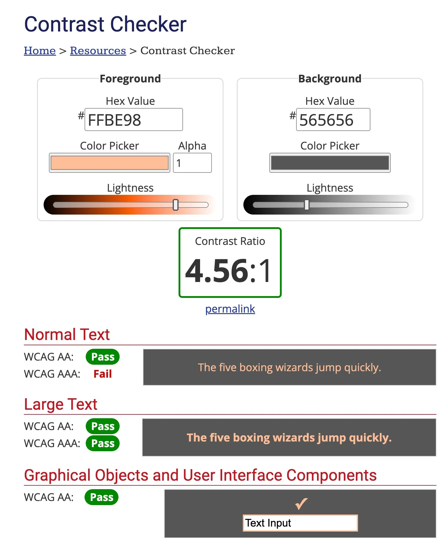
Here are some free online tools to test your colour contrast against the WCAG:
In creating our colour palettes for this post, I ran the colours through WebAIM’s Contrast Checker to confirm that they meet this minimum. I highly recommend this tool for measuring your contrast ratio against the WCAG.
I don’t need 5 colours. What should I do?
No stress. You don’t have to use all 5 colour palette spots. If you don’t need a fourth colour, my tip is to duplicate your statement/brand colour, like in this example: