Design Stylish Film/TV Project Pages with the Squarespace Blog Editor
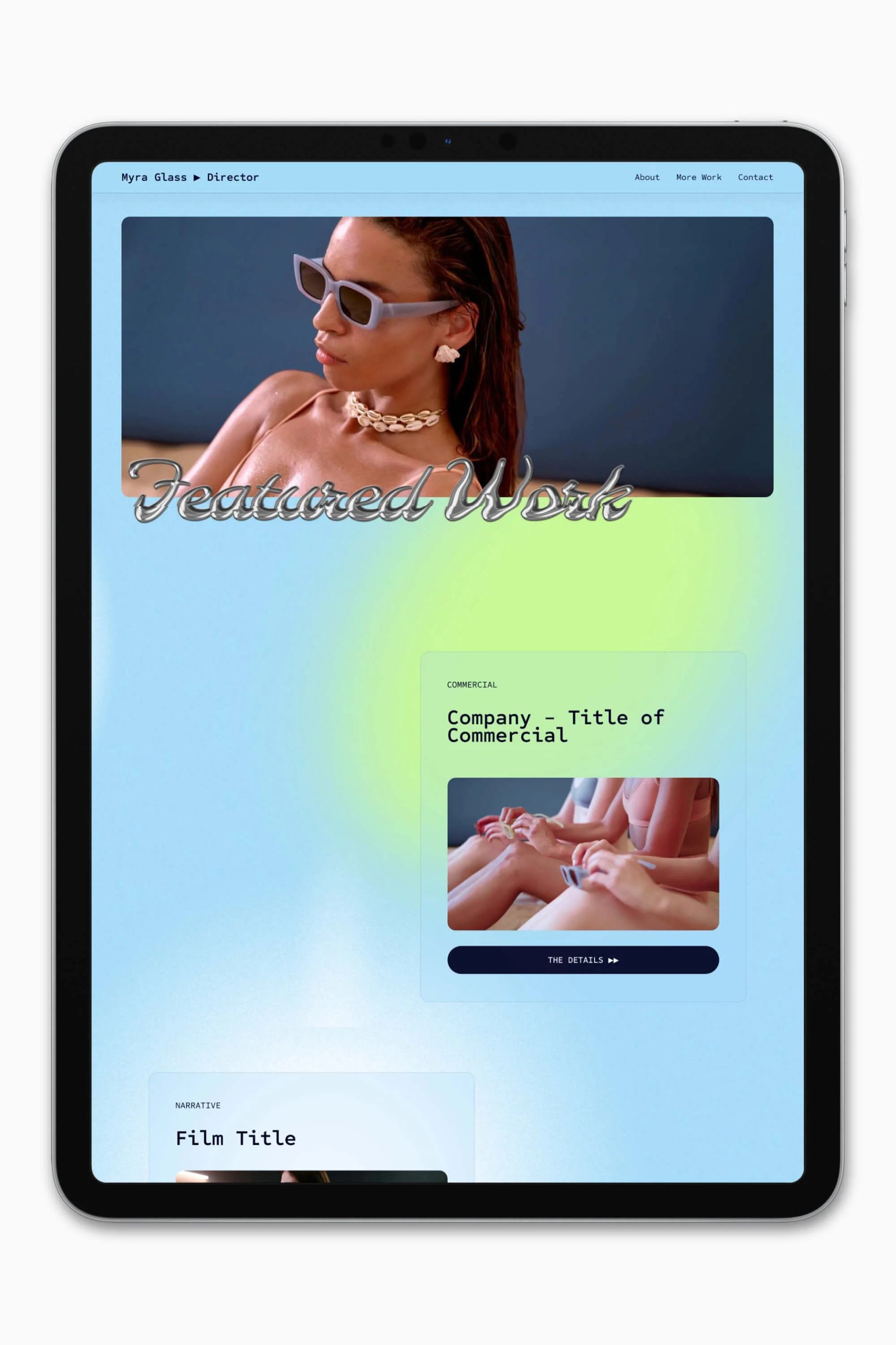
While their names may be misleading, blog pages and blog posts are an excellent solution for presenting film and television projects on a website built on Squarespace 7.1.
Blog posts are my top pick for creating project pages, as a Squarespace web designer, allowing me to set up sorting options—like this dropdown filter. I can also make use of summary blocks, which opens up more design features and possibilities in other areas of a website.
If you’re new to the Squarespace platform or wondering how to make your project layouts look less basic and more pro, you’ve landed in the right place.
In this post, I'm going to break down 4 layouts for film and TV projects as a source of inspiration. After that, I will cover how to use Squarespace’s classic editor and share my top tips for designing with it.
Once you’ve read this guide and with a bit of practise, you’ll be able to confidently and swiftly kick your project page designs up a notch.
🎁 Building your own website? Grab my free Squarespace website template for filmmakers.
This post covers:
Creating a film/TV project template
If you’re building a website to showcase your film or television work, creating a project template that you can reuse again and again is a great time saver. Simply duplicate the blog post, plug in your content, and remember to edit the URL before hitting publish.
The first step is to design a layout that you're satisfied with. I like to design 1-3 project templates for my clients, depending on the type of projects they work on.
For example, if you work across both film and theatre, you may want to design a different template for each discipline.
What editor do blog posts use in Squarespace?
Blog posts in Squarespace 7.1 and 7.0 use the classic editor, which is Squarespace’s older drag-and-drop editor. For those newer to the site builder and using Squarespace 7.1, you may be more acquainted with Fluid Engine, which is the default editor for pages.
So in sum, blog pages use Fluid Engine, but blog posts don’t.
The classic editor allows you to design and edit layouts using various content blocks (e.g. text blocks, accordion blocks), which can be moved by drag-and-drop. However, it is not as smooth as dragging blocks around using Fluid Engine.
Other key differences between the two editors are spacer blocks are essential for designing with the classic editor, and you cannot layer or overlap blocks like you can in Fluid Engine.
Nevertheless, limitations aren’t the end of the world. In fact, as a filmmaker, you’re probably familiar with how creative limitations can often lead to better results!
Inspiration: 4 project layouts built with the classic editor
In this section, I’ll go over 4 project layout ideas and show you how I’ve created them in the classic editor. You’re welcome to recreate these on your own website.
Afterwards, I'll share with you my hot tips for designing stylish page layouts with the Squarespace blog post editor.
Each of these 4 designs are built using the same building blocks: text blocks, a button block, a gallery block, and a video block. As a design foundation, I’ll be using Moulin, one of our premium Squarespace website templates, which is available to purchase in the Store.
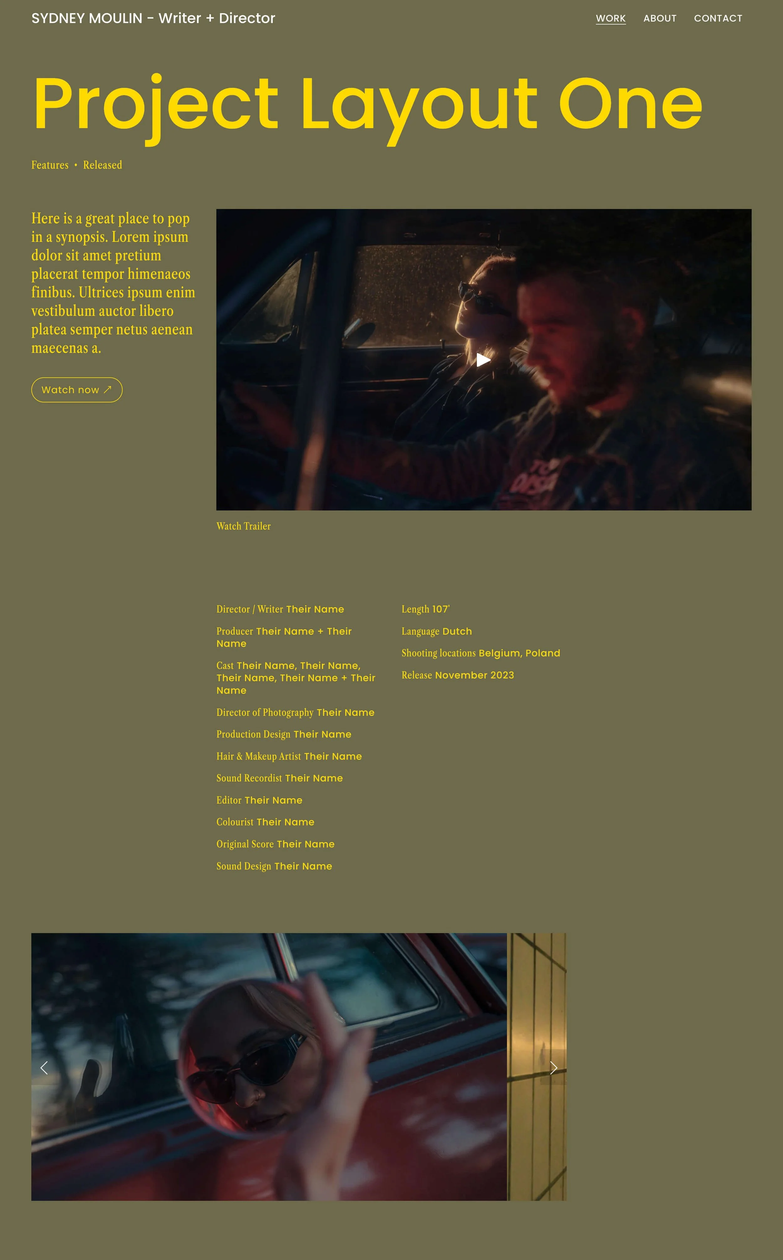
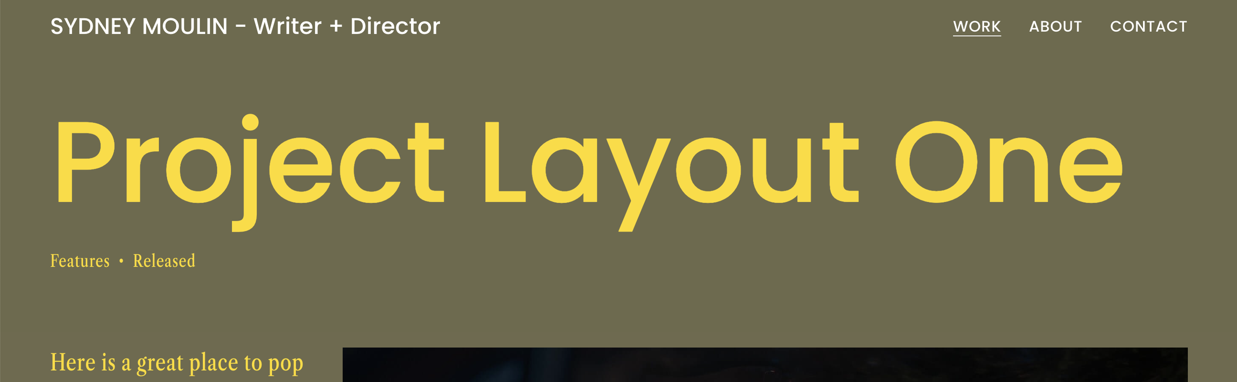
Project Layout One: The 4-column grid
This design uses a gallery block set to Carousel, with the Show Next and Previous Controls ticked under the block’s settings. You can also set the images to auto-transition.
In web design, a grid is your best friend, creating alignment and consistency in your design. It’ll make you look good, even when you don’t really know what you’re doing 🙃. Design without a grid and your layout could risk looking random and amateurish.
Moreover, by simply changing the number of columns in your grid—as you’ll see in the next few layouts—you can create a diverse range of designs. I’ve used a 4-column grid for Project Layout One, which is easier to recognise in the graphic below 👇.
I’ve chosen to keep the visual content 3-columns wide—a comfortable viewing size, while still blending into my 4-column grid. Meanwhile, the narrow columns make it easier for text to be read.
Notice how I’ve used several spacer blocks to control the size of other blocks? Being invisible, spacers also introduce white space into my design, creating breathing room around the content.
You can see where I’ve used a full-width spacer block as well, before the gallery block. This spacer allows me to basically “reset” my grid—and, in effect, allows me to make my gallery block 3-columns wide, instead of one.
It’s the same reason why I’ve used a spacer underneath the trailer video. In this case, I’m moving from a block that’s 3-columns wide to 3 narrower blocks.
Here’s a PRO TIP: Use wider spacer blocks whenever you wish to change up the column width of your next block.
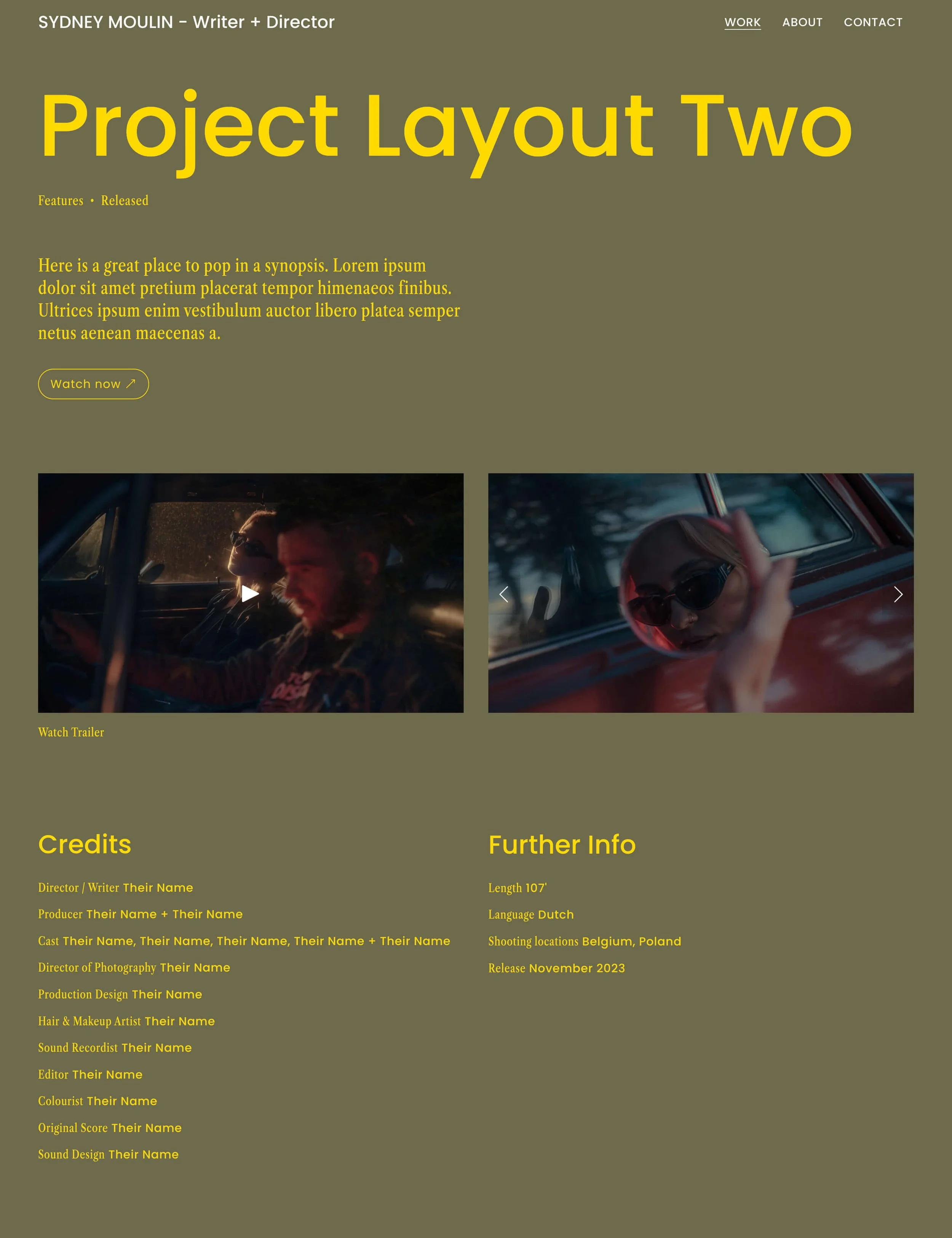
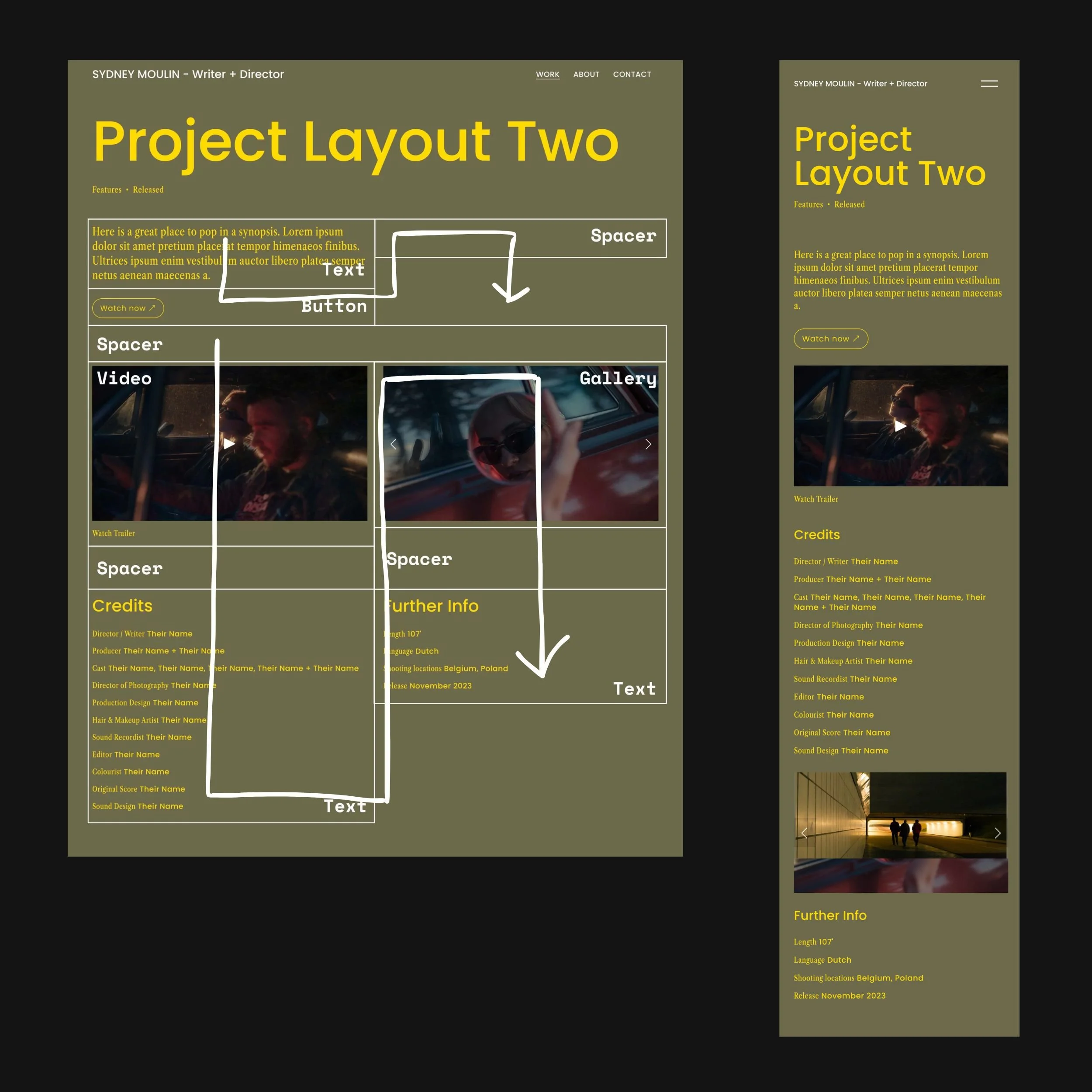
Project Layout Two: The 2-column layout
My 2nd design is based on a 2-column grid that is also achieved using spacer blocks.
With Project Layout Two, I’ve divided the top section from the body section using a full-width spacer block. This is to get the trailer and image gallery to align.
To pull off alignment of these 2 visual elements, you’ll also need to ensure that the 1st image in your gallery is 16:9, and your gallery is set to Slideshow.
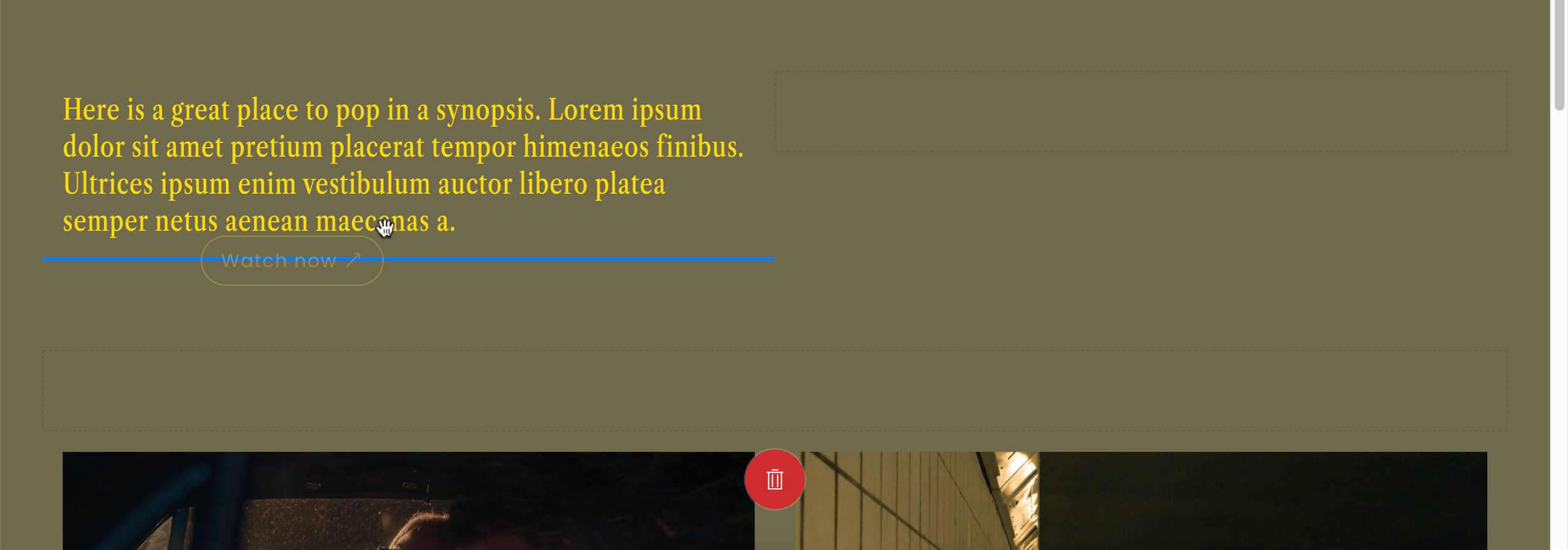
Because I wanted to add a call-to-action to the video description, “Watch Trailer”, I’ve inserted spacer blocks beneath both the video and gallery so that the two bottom text blocks top-align.
PRO TIP: When blocks fail to align, add and resize spacer blocks to create your desired alignment.
So as you can see, spacer blocks have many purposes in the classic editor.
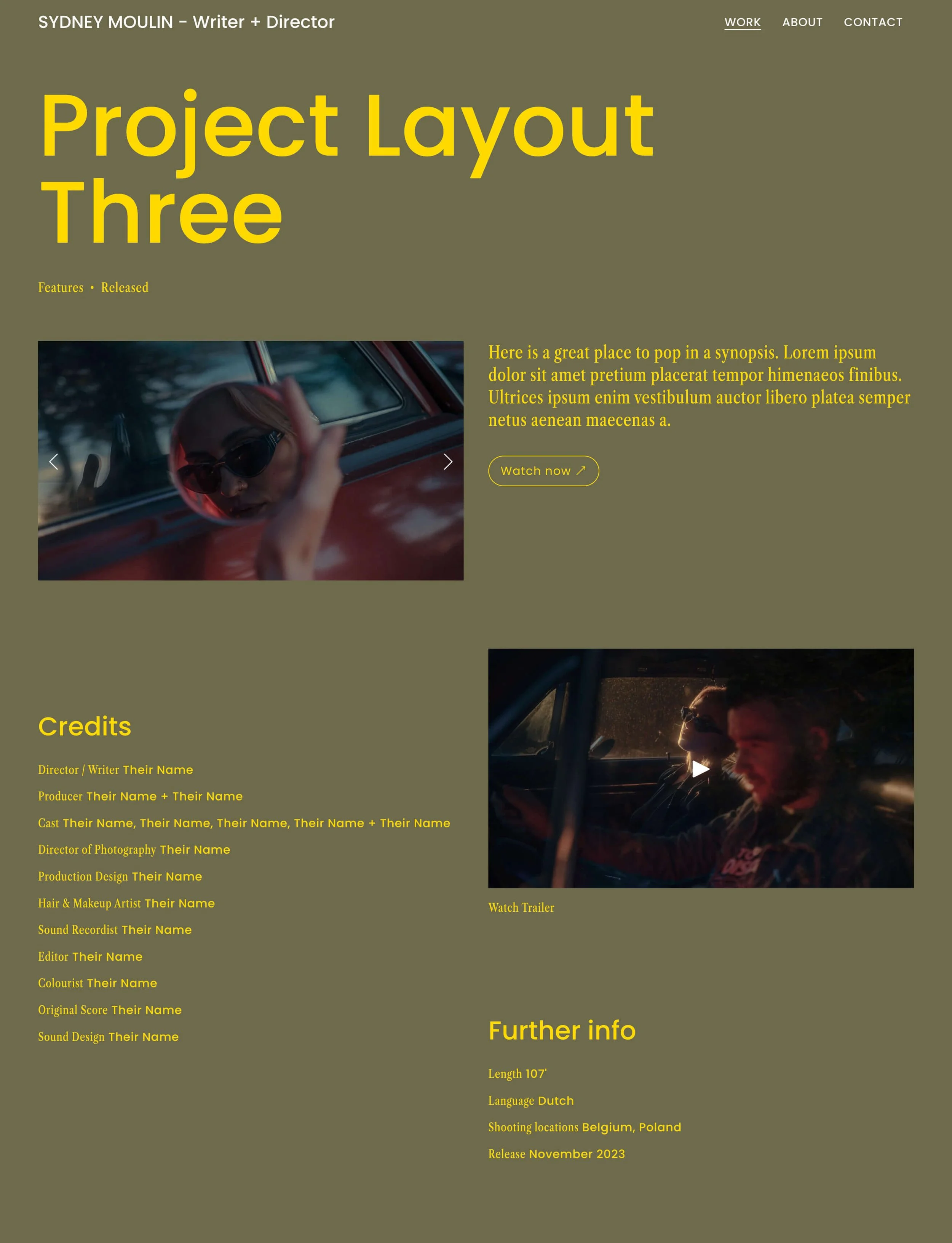
Project Layout 3: The masonry / waterfall layout
Compared to the previous design, Project Layout Three is less rigid about alignment of blocks across columns, instead following a loose masonry grid, aka waterfall layout.
But don’t be mistaken. It still follows a 2-column grid, and makes use of you guessed it—spacer blocks!
If a grid is your new bestie, then spacer blocks are your ultimate secret weapon. 🥷👊
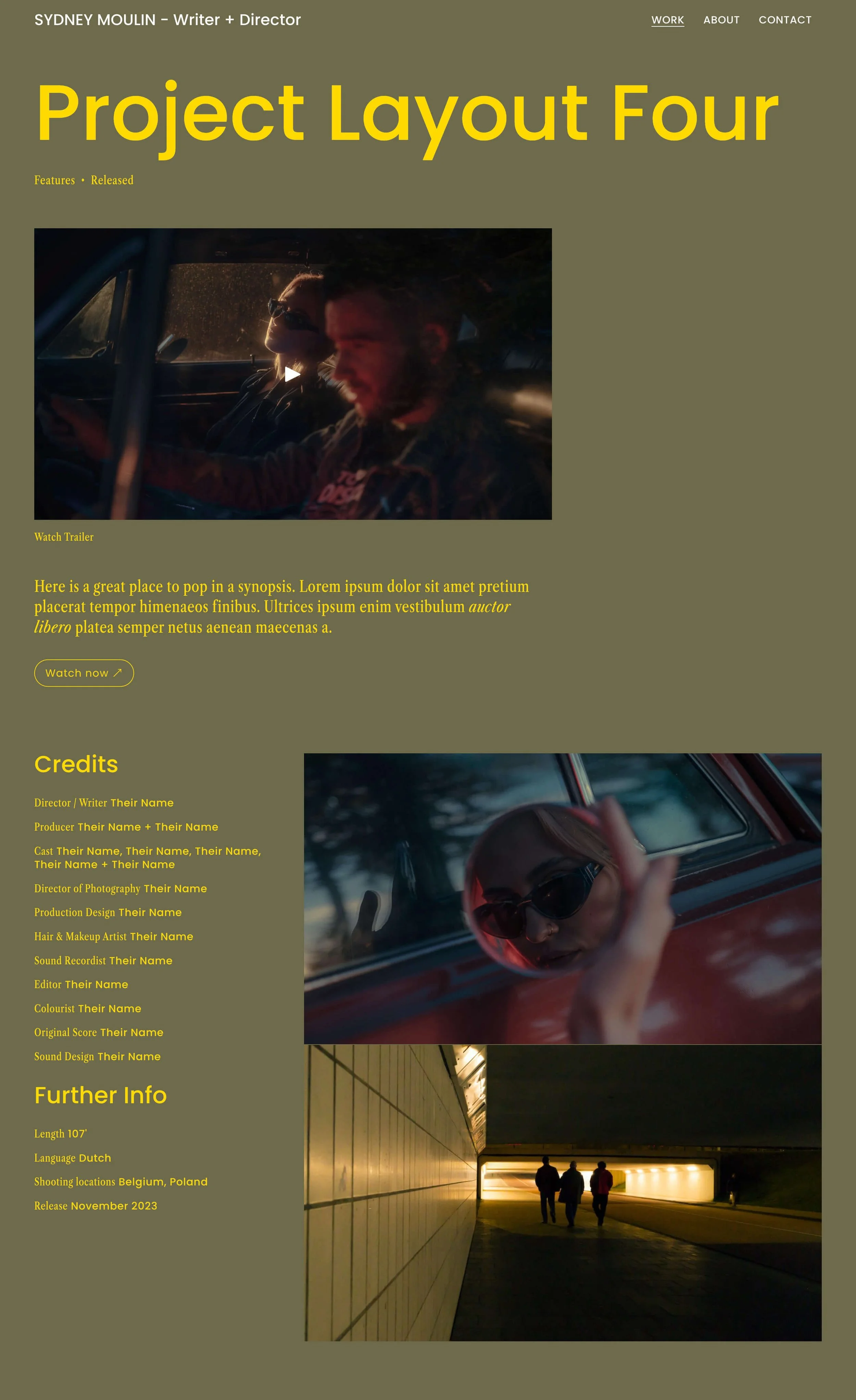
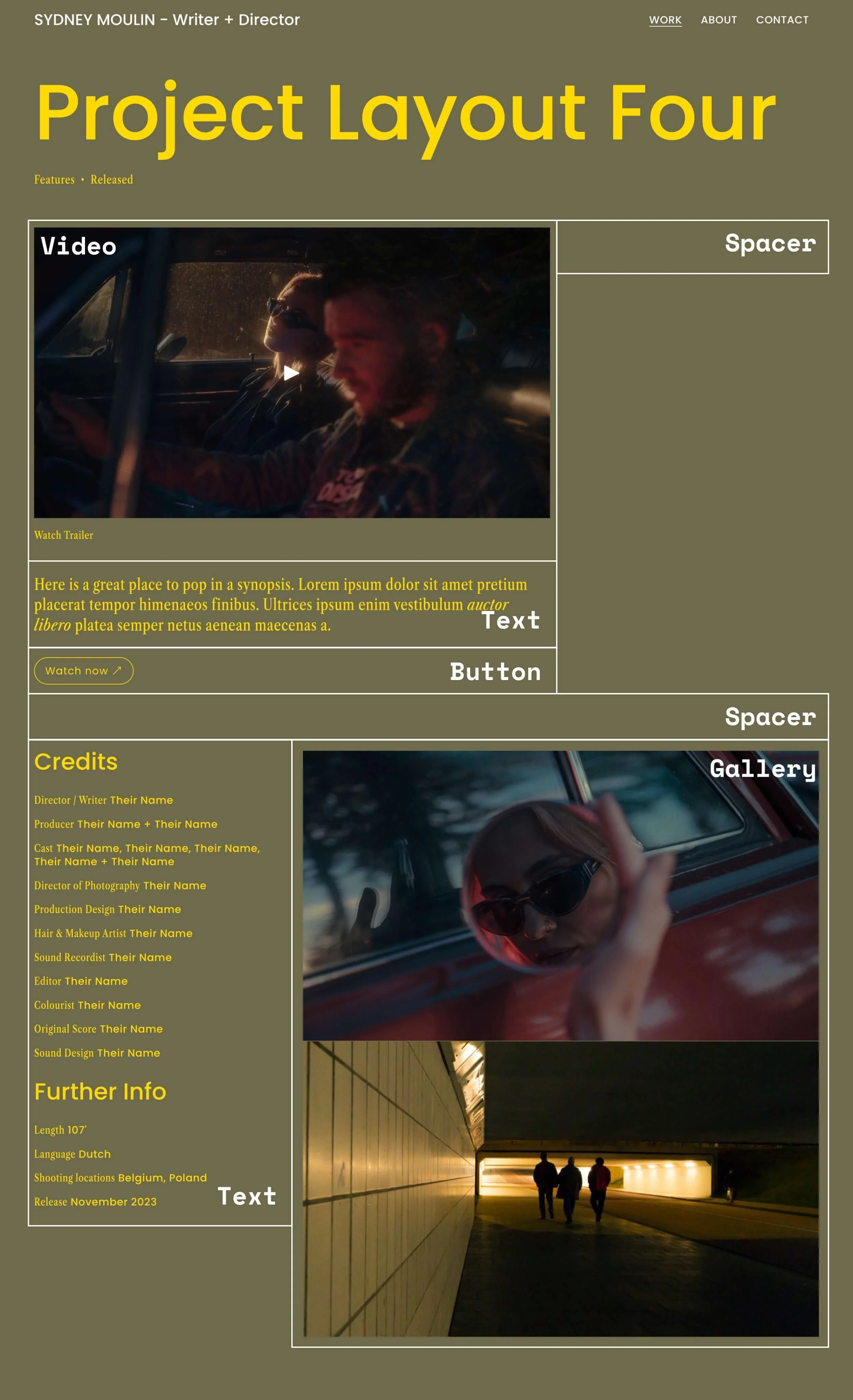
Project Layout 4: The 3-column grid
Funnily enough, this project layout uses the least number of blocks to pull off. Maybe I should have shown you this one first 😆.
You’ll notice that the top section starts with a 2/3 + 1/3 layout. Then I flipped it for the bottom section to add visual interest to the design. This layout would probably work really well on a Squarespace portfolio that uses a 3-column grid on the main blog page.
PRO TIP: Whatever grid you pick for your project pages, aim to follow that same grid on the other pages of your website to maintain design consistency.
As the Credits and Further Info sections run in a single column here, I’ve set the gallery block to Stacked to restore visual balance.
How to style the blog posts header
Every blog post begins with a header. Because blog posts are a type of collection page, whatever style you apply to one post will apply to every post on your website.
In the blog editor, hover over your page to bring up the Edit section button near the top-right corner of the editor.
You can customise these header settings:
Text alignment — choose to left or centre-align the title
Show categories — for project pages, I toggle this on
Show date — for project pages, I toggle off the post date. But note that if you’re writing a blog, your posts will be missing dates too
Meta position — if you’ve toggled on categories, do you want them to display above or below the title?
Delimiter style — pick a divider that’ll show if a post has multiple categories
Header spacing — this is the space under your header, before the content of your post
Content width — wide, medium, narrow or custom?
In my example above, I’ve chosen a wide content width, left text alignment and for my categories to display below the title. My delimiter style is a bullet and my header spacing is 62px.
Customising your post title, meta and pagination styles
A common question (and one I’ve had myself) is can you add a banner image above your title. The answer is no. Squarespace hasn’t got that option, although potentially it can be done with code.
To change the size or font of your blog titles, you’ll need to head into your global Site Styles.
STEPS
Click the paintbrush icon in the top-right corner to access your Site Styles.
Click Fonts.
Click Assign Styles.
Scroll down to find the section ‘Blog posts’. Click Title.
From here, you can edit the style and size of your blog title.
From Assign Styles, you can also edit the appearance of your meta categories, author profile, and blog pagination.
How to use the classic editor when designing project pages
I hope those 4 project layouts have sparked your creativity. Now, let’s go over the basics of how to work with the classic editor.
To insert a block, hover over the page and click one of the blue insert points that looks like a plus sign. You can then pick from a wide range of available blocks.
Click and hold to move a block. Wait for a horizontal or vertical blue line to appear, indicating where dropping the block will insert it.
More contextual information is provided by the height or length of the blue line. Manoeuvring a block into its exact spot is where the classic editor can be a bit fiddly—just remember to exercise patience.
When you insert a block into a row, it’ll auto-resize the width of other blocks in that row so that their widths are equal.
To manually resize your columns, hover over the edge between 2 columns. A thin blue line will appear, and your cursor will change to drag handles:
My classic editor design tips
Spacer blocks are your secret weapon
As our 4 project layout examples have revealed, spacer blocks are your secret weapon for perfecting more visually-interesting layouts with multi-columns in the classic editor. It’s your secret sauce to having more precise control over your columns.
You can also use spacers to introduce white space and balance into a design.
And unlike other types of blocks in the classic editor, you can drag the bottom of a spacer block to resize it:
Design to a grid
My second tip for designing more compelling project layouts with the classic editor is to follow a grid. Feel free to play with the options of a 2-column, 3-column or 4-column grid.
Once you’ve picked your favourite, stick to it, and use it to guide your design. To make the design of your whole website look more harmonious (and designed by a pro 😎), keep that same grid across other pages.
Design simultaneously with Mobile View in mind
Thanks to the classic editor, you only need to make minimal design adjustments in Mobile View. But as you’re working on Desktop View, bear in mind how Squarespace will translate multiple columns into a single column for mobile.
As you can see below, the classic editor will order your blocks by moving down each column and page left to right.
Which is another reason why spacer blocks are a super useful tool—it adds a “period” marking the end of a column.
Another thing to note is that spacer blocks, while having an influence on block order when viewed on a phone, remain hidden in the classic editor’s Mobile View.
But you and I both know how important these invisible blocks really are.
DIY EASIER WITH WEBSITE TEMPLATES


