Is Your Website Faceless? And 7 Ways to Fix It
Are you hoping that your website will help you gain more connections and book more jobs in your industry, whether that’s film, television, and/or theatre?
If you answered “no” or with a shrug, then I wonder why you’d even bother having one…
But if you answered “yes”, then a key to creating connections with your website is to ensure it isn’t faceless. What do I mean by this?
A faceless site 🫥 lacks personality or a personal brand, one that gives visitors too few clues as to what you’re like as a person to work with. Instead, your site should act as an extension of your professional identity in real life.
Arguably, what you’re like to be around—and your soft skills—is as much a contributing factor to you being hired as the hard skills and creativity you bring to the table.
That’s why having a faceless website that hides rather than reveals your character can only get you so far. You’re not tapping into the full potential of your site to support your career!
These are 3 common web design mistakes that I often see, and that translate into a lack of identity:
Not including a photo of yourself on your personal website
Sticking to a black and white colour palette
Having no written content (copy) or minimal copy
If you think your website is veering into no-face territory, here are 7 fixes to add individuality to your website:
🎁 Building your own website? Grab my free Squarespace website template for filmmakers.
Include your photo on your About page
This first fix is practically an essential requirement of any online portfolio or personal website. Surprisingly, I’ve seen many filmmaker portfolios that don’t include a photo of the artist the website is promoting.
Seems illogical, right? As someone who is happy working behind the camera, even I had to push past my photo shyness to include pics of myself on our website.
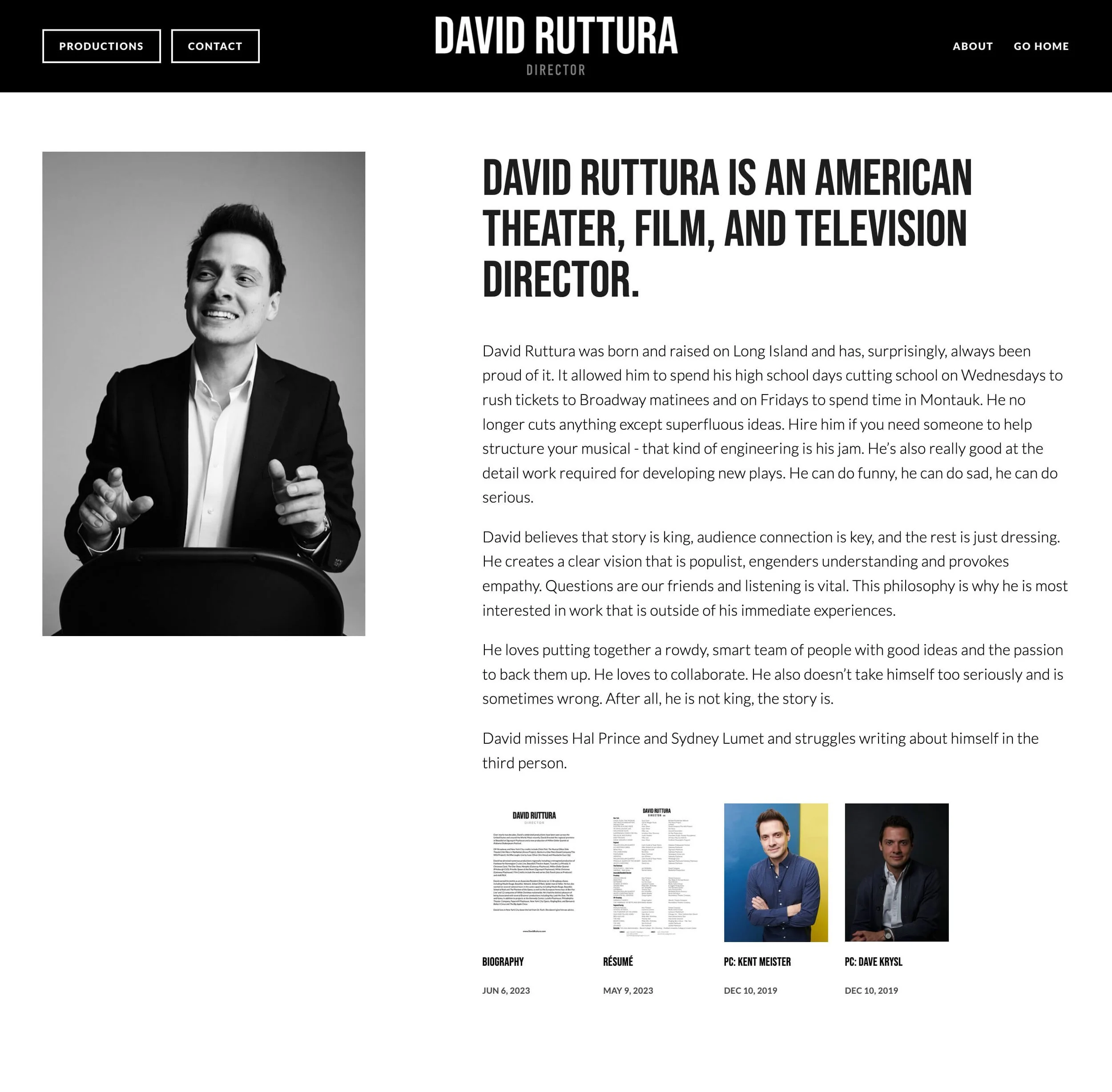
Example from the About page of David Ruttura. The photo of David on the left is one of several in an auto-playing carousel.
Honestly, having at least one photo on your website will make a significant difference in fostering a connection between you and your site visitors. It adds a face to a name.
For example, when I’m directing a film, and I’m looking to work with a new cinematographer, editor, producer, etc, I like knowing who to spot in a crowded café when we’re meeting for a first coffee. I’m not asking for a blind date here! 😅
Photo Picking Tips:
Avoid selfies or pics that are clearly taken on a phone or cropped out of a group photo. Committing any of these ‘sins’ can make you look unprofessional!
If you don’t have any nice, professional-looking photos of yourself, ask a friend who knows photography to help you out. Or, if you have a bit of budget, consider investing in a professional photoshoot.
Ideally, you should be framed no wider than waist up. Depending on your comfort levels, you can go for a close-up or medium close-up.
Don’t be afraid to look down the camera lens, as the most eye-catching portraits do.

Add BTS photos into your website design
Once you’ve gotten comfortable having a photo of yourself on your website, you may like to go a step further.
Why not consider sharing a collection of photos of yourself/your team working behind-the-scenes on an about, contact or services page?
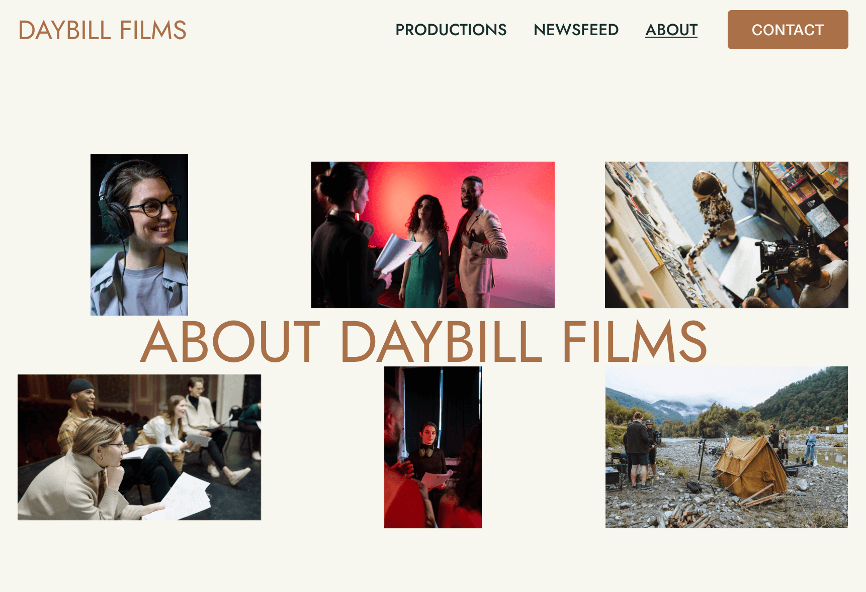
Example of a BTS gallery from our Daybill Squarespace template.
Alternatively, you can sprinkle them across your website. People—whether they’re working in your industry or fans of your work—are endlessly curious about what goes on BTS.
Sharing pics of humans collaborating on a set or rehearsing ahead of opening night can make people feel more interested and invested in your artistic endeavours.
Again, professional stills are invaluable if you have them. You can get away with the occasional well-lit wefie, but ditch those low-quality photos.
On the web, you need to make sure that your photos are high-res enough to not appear blurry on high resolution monitors. For Squarespace users, ensure that your images are 1500–2500 pixels wide and compressed ↗ before you upload them.
Write in first-person
There’s no rule that says you have to write in third-person to sound professional or official on your website.
Here’s a great example from the personal site of Katie Anne Clark that opens with copy written in the first-person.
On her homepage, Katie Anne Clark writes:
“Musical Theatre: the greatest words in the human language! I love that my job is to let an audience escape their lives for a couple of hours: to make people laugh and forget their troubles, even for a small amount of time. I love casting and figuring out the game of where to best put people. I also love working towards a more equitable industry and world.
“Want to make magic? Take a chance on me.”
Not only do we get a clear idea of what drives Katie, but we feel like we’ve been invited into a conversation with her.
Writing in first-person is a sure-fire way to encourage people to connect with you on a personal level.
You can use first-person across your website, or keep it to specific sections, like the homepage intro of Katie Anne Clark’s website, which uses the third-person in other areas.
Other good places to write in first-person are in your author profile and when posting to a blog. Keep reading as I go into both of these ideas further down! 👇
Add an author profile
How often do you land on the homepage of a website first? Sometimes, right? Search engines have been developed to get us to the information we’re seeking as fast as possible.
This means that your site visitors may land on one of your projects or posts, skipping your Homepage or About page introductions entirely—leading to a missed connection.
One neat solution is adding an author profile to your Squarespace website. It appears at the bottom of every blog post—and every sub-page of your portfolio if you’ve built it with a blog page. Author profiles are a standard feature of most site builders that have blogging features, like WordPress.
Example of an author profile for a production company from our Daybill Squarespace template
Your author profile is your chance to introduce yourself to your visitors, e.g. “Hey, I’m Jo—screenwriter and director…”
This short intro can help visitors perceive you as a multidimensional human and not some faceless creator. Or if you’re a company, it’s a great place to instil the values that underpin your work, while building credibility.
Always end your author profile with a linked call-to-action that directs visitors to perform an action, like ‘View More Work’ or ‘Contact Me’.
For more help on what to write in your author profile, check out The Art of the Mini About (And Where To Put It On Your Site) ↗ by Between the Lines, which is where I discovered this great idea!
How to add an author profile in Squarespace 7.1:
Click here ↗ to open your account settings.
Add a photo to your profile, which will display in a circle frame.
Add your information under profile info, additional info and bio. TIP: you can bold/italicise your text and add call-to-action links.
Add a Mini About to your footer
Following on from author profiles, another good/alternative place to add a Mini About is in your Squarespace footer—where it’ll appear on every page of your site.
That way, it has a higher chance of being seen by your site visitors before they navigate elsewhere.
In the below example from the Squarespace site of actress Montego Glover, the heading outlines who she is, before giving us a short bio. It shares some of her career highlights and other involvements.
A Mini About on the official Squarespace site of Montego Glover
Underneath this copy, a call-to-action button informs visitors what action to take next. Ultimately, what makes this Mini About so effective is the smiling portrait of Montego Glover herself.
How to set up a Mini About in a Squarespace 7.1 footer:
From inside the page editor (doesn’t matter what page you’re on), hover over your footer.
Click Edit Site Footer.
You’ll want to create a new section above your regular footer section. Click Add Section.
Select Add a blank section.
Use this new blank section as the canvas for your Mini About using text blocks, a button block, and don’t forget a photo!


Start a blog
Out of the fixes on this list, blogging takes the most commitment but could have some of the largest benefits.
A blog is an effective way to invite people to get to know you better. You can also attract more site visitors by improving your search engine rankings (SEO) over an extended period of time.
Now, you might be thinking, why should I care about my SEO? For personal site owners, I think your most important goal is for your website to appear on the 1st page of Google when someone searches your name.
After all, what’s the point of having a website if no one can find it?
A common misunderstanding is that if your domain name matches your personal name, then you will automatically show up high in search results. But it’s not true.
Interestingly, I’ve come across Squarespace sites of filmmakers and theatre-makers whose portfolio websites are hard to find in Google search results. And don’t appear until like page 7… 😦
There are a lot of ways to help optimise your site, and one method that takes patience but has steadily improved my search rankings in the past 1.5 years is blogging.
One of the most common format for blogs in the film, TV, and theatre industries is a News blog—posting successes and announcements in third-person. I find this kind of format is best suited for organisations, as the brand voice that emerges tends to be more formal.
However, if you’re running a personal website as a creative freelancer, you have the luxury of opting for a more informal and friendly tone of voice. Whatever feels natural to you.
You may want to consider posting about what you’ve been working on lately, as well as exciting news that you wish to promote.
For instance, my sister is a playwright/theatre-maker 🎭. She’s started a blog (admittedly, on my encouragement) to journal about and share photos of the devising process she’s been involved in.
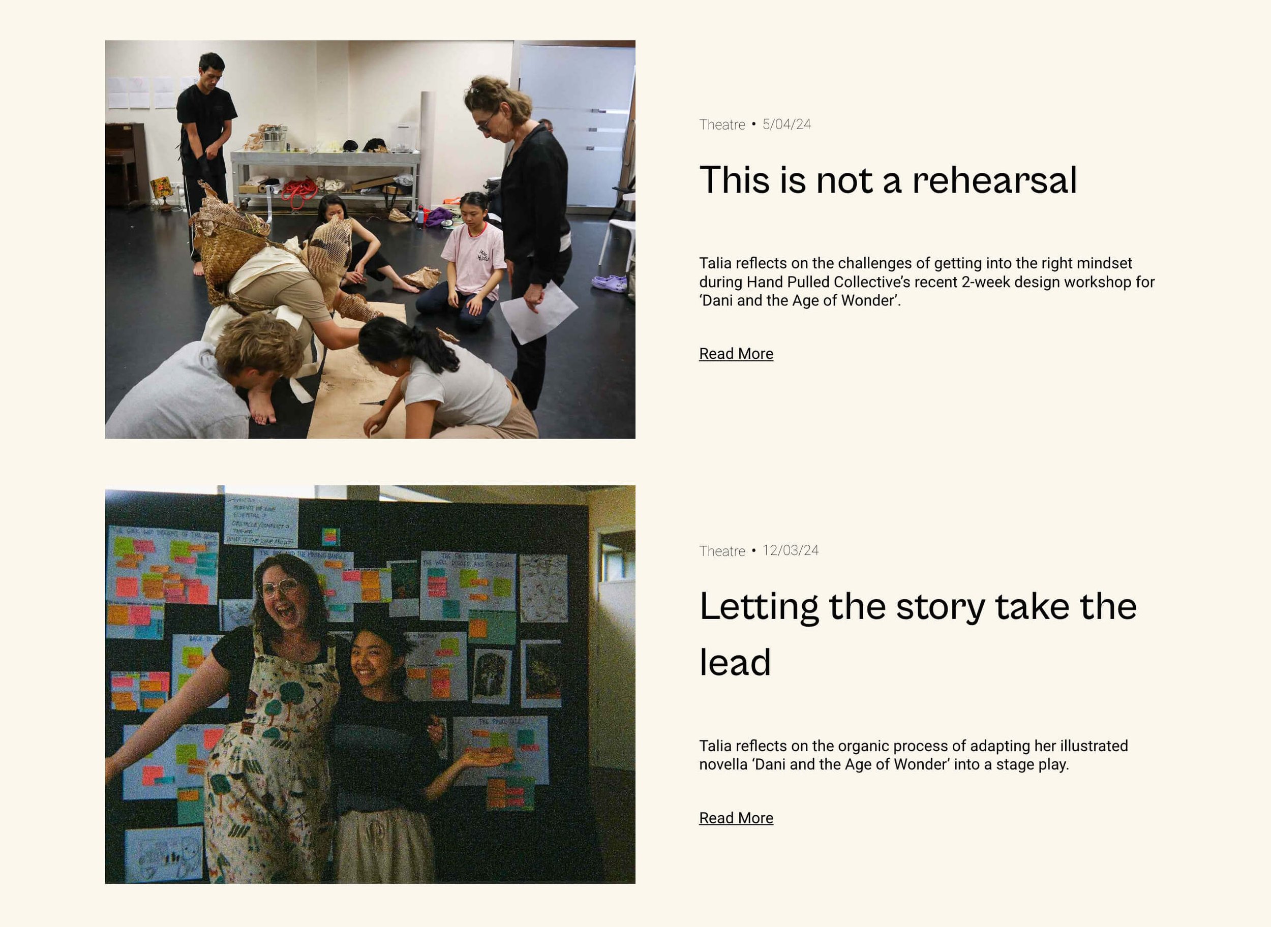
A snapshot from the blog of Talia Pua’s Squarespace portfolio
Which brings up another positive of blogging about the behind-the-scenes process—it can help fill a gap when you are busy developing work, but don’t have any finished projects to add to your portfolio.
Tips for maintaining a blog:
If you’re using a website platform like Squarespace, it’s super easy to add a blog page to your site. Begin by clicking a plus icon in the Pages panel, then select a Blog collection page.
Blog consistently — even if you’re only able to write 3 times a year, aim to maintain that rate annually. Plus, it signals to readers that they can expect to hear more updates from you. I’ve read some enjoyable posts, only to realise that the author’s last entry was 3 years ago 😢.
Maintain a consistent style of voice — decide if you’re going to write in first-person or third-person and stick with it.
Keeping a blog is work. I often get stuck on what to write. But one way that helps me out of a rut is I’ve started to ask myself what will be the most fun thing to write today.
You will probably not feel like a good writer to begin with, but the more you blog, the better you’ll become.
Pick a colour palette that reflects your personality
If writing is a struggle for you, a visual way to inject your personality into your website is with colours!
Here’s an example of a portfolio site I designed this year for film and TV editor Brendon Chan, which uses blues and yellows:
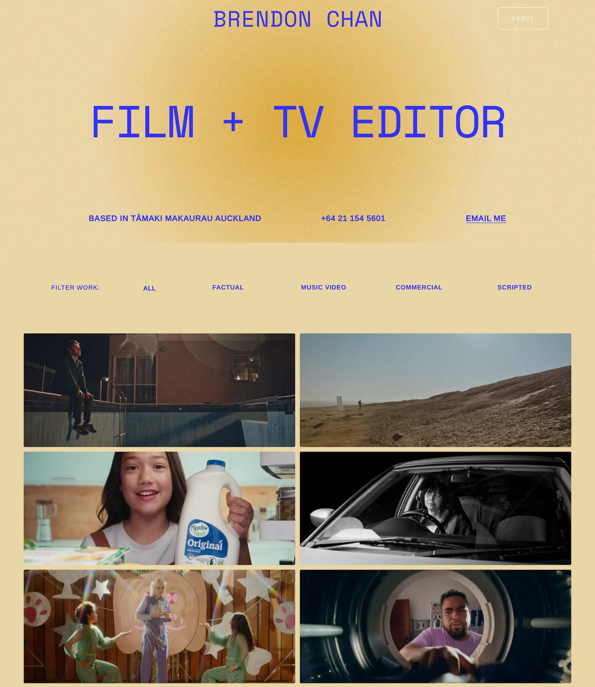
Any client who’s worked with me knows that I generally advocate against black-and-white websites. They are just so much harder to pull off with flair for non-designers, as this colour scheme is extremely popular amongst creatives. Black-and-white websites rely on distinctive layouts and thoughtful typographic choices to make a statement.
Don’t feel a full palette of colours is a true reflection of your character, then how about picking one brand colour? Such as the site of cinematographer Catherine Goldschmidt, which uses a purple accent colour for a more subtle impression.

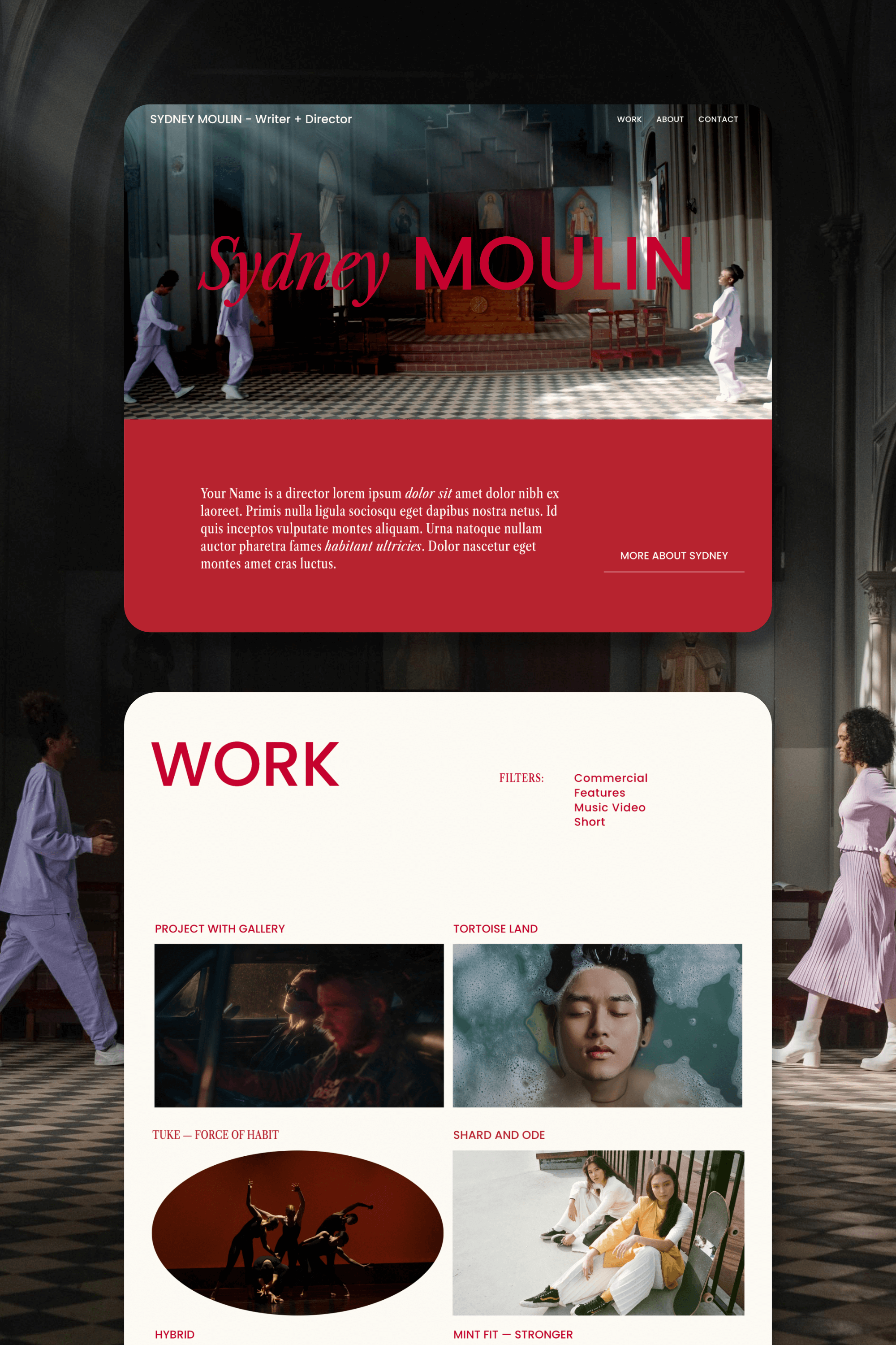
Our Moulin template for Squarespace was also designed to incorporate a single brand colour to make a statement: